


Network Status Chord Diagram
- What is the Chord Diagram that is on the App home page
- How to use the Chord Diagram
What you are going to learn:
What is the Chord Diagram 
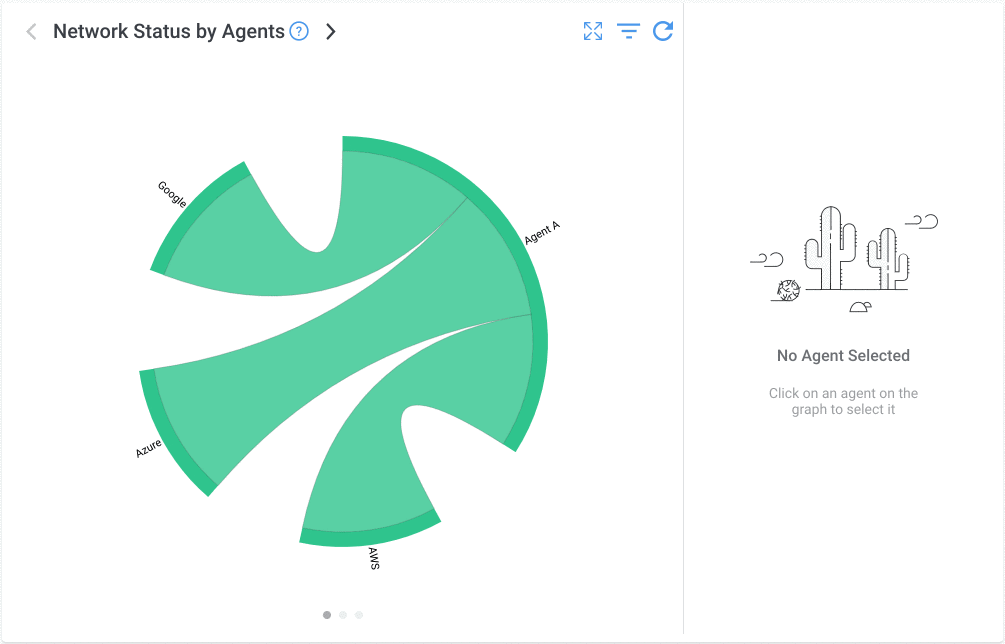
Obkio's signature Chord Diagram is a provides a visual representation of network status by Network Monitoring Agent and provides a single visual overview of global network performance.
This diagram will show you all the Agent Status details and the Network Monitoring Session Status details.
How the Chord Diagram Works
The Network Status Chord Diagram is the first thing you'll see on your home page when you log into the Obkio App along with Monitoring Agents and Network Monitoring Session that you have configured.
Located outbound of the circle (called the nodes or endpoints), you will see every Monitoring Agent you have deployed along with their status color. Inside of the circle (called the arcs or segments), you have the Network Sessions with their status color that are refreshed every 60 seconds.
By clicking on one Agent, you can quickly navigate to the selected agent's detail page to see more information about that status of the agent. The same thing applies for the network monitoring session detail page, which you can access by simply clicking on the session you want to analyze.
Chord Diagram Filters
Chord Diagram offer various to filters to you give you more flexibility on what you want to see displayed on the diagram. You can learn more about all these filters on the Chord Diagram Filters page, but here is a quick overview:
- Filter by Agents or Group of Agents
- Filter by Session Severity
- Show OK Agents filter
