Obkio Visual Traceroutes
- What are Obkio's Visual Traceroutes
- Where to access Obkio's Visual Traceroutes
- How to read and interpret Obkio's Visual Traceroutes
What you are going to learn:
Obkio's Visual Traceroute feature allows gives users full visibility into the network path between two Monitoring Agents within the same Network Monitoring Session. It automatically collects traceroute data for each session and displays hop-by-hop performance metrics, including packet loss and latency.
A traceroute is performed every 1.2 seconds, and the results are aggregated in real time every minute.
This feature is automatically enabled for all Monitoring Sessions in Obkio's App and presents the results in two main forms:
Historical Traceroutes, showing how the route evolves over time.Reverse Traceroutes, displaying the return path to help identify issues caused by asymmetric routing.
Included in all Obkio plans, Visual Traceroute helps network professionals validate routing behaviour and troubleshoot performance issues quickly and accurately.
Obkio's Visual Traceroute feature is fully integrated into the Network Monitoring Sessions. They run automatically as soon as a Monitoring Session is configured and can be viewed and analyzed from the Network Performance Tab.
- Click the the
Network Performancetab in your Obkio app menu. - Select the
Network Monitoring Sessionyou want to investigate. This will open a page with more details. - Scroll down the page to view
Obkio's Visual Traceroutes.

You can also add your Visual Traceroute data as dashboard widgets to any of your Obkio Dashboards.
- Go to the
Dashboardstab and choose an existing dashboard (or create a new one). - Click
Add Widget. - Under the
Network Performance Metrics, select theAgentandSessionsthat you’d like to visualize. - Select
TraceroutesunderGraph Type. - The widget will then be added to your dashboard. You can resize or arrange the widget as needed; it automatically adapts to your screen size.

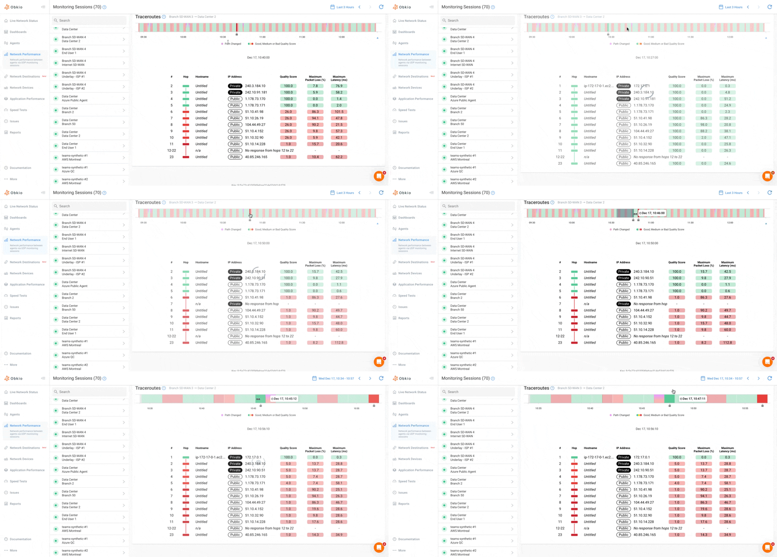
Visual Traceroute displays the traceroute data in an interactive graph made that includes two sections:
- A horizontal timeline uses coloured segments to show the overall quality of the network path at each moment.
- Green indicates a good quality score, yellow indicates medium quality and red indicates poor quality.
- Purple markers denote path changes, meaning the route between agents changed at that time.
- Selecting a point on the timeline updates the hop details below.

- Each row corresponds to a hop (router) along the route.
- For each hop, the table displays the
hop number,IP address/hostname,maximum packet loss (%)andmaximum latency (ms). - The final row summarizes the total packet loss and total latency across the entire path.
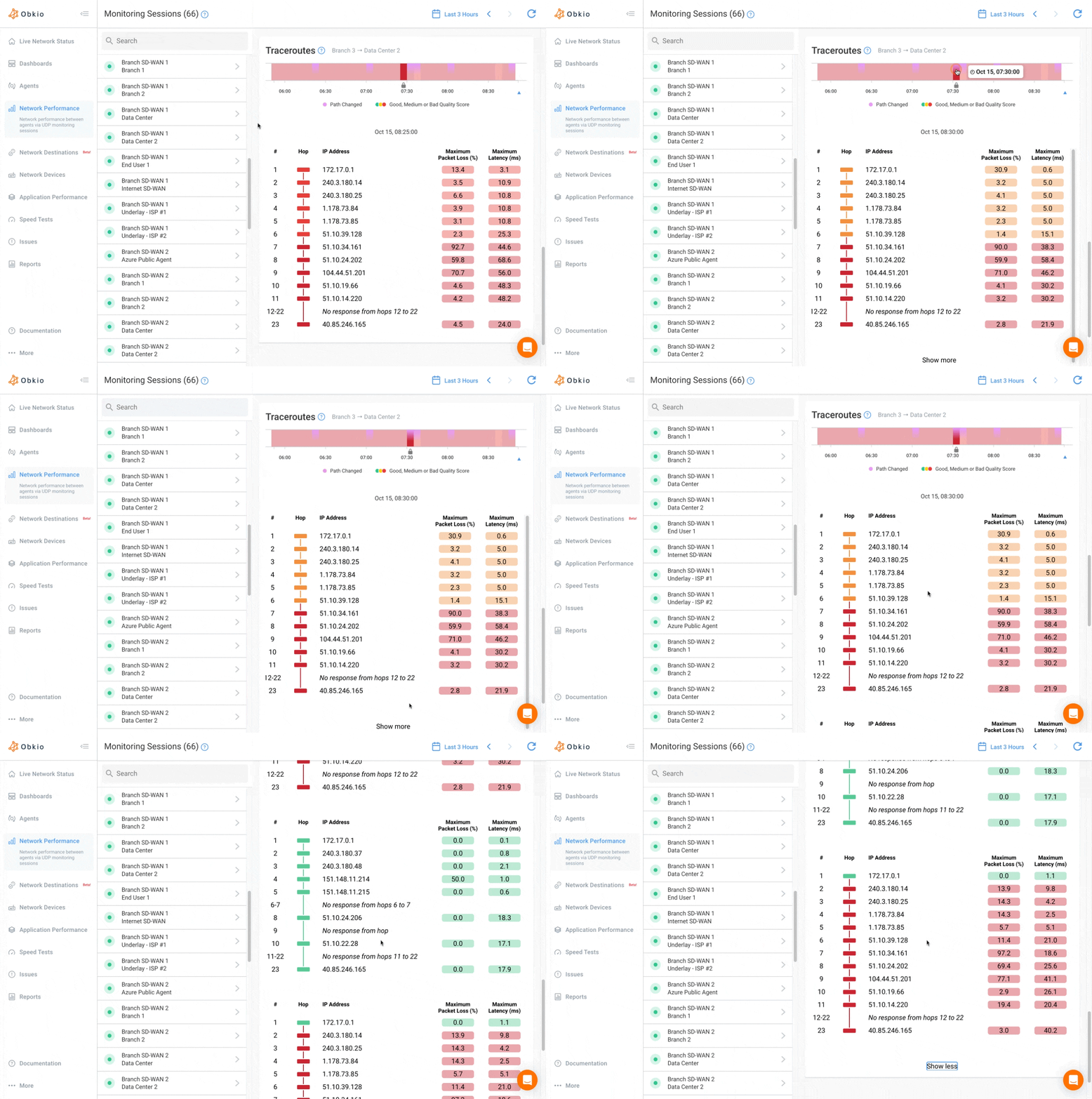
- When you hover over a hop, a tooltip shows the
IP address, the reverseDNS hostname(when available) and theQuality Score. - Separated traceroutes tables are shown when the path changes, by clicking on the
Show morebutton
Public/Private IP Labels
Each hop in the traceroute displays a label indicating whether it's a private or public IP address:
- Private IP: Hop is within your internal network
- Public IP: Hop is on the public Internet
This labelling helps you instantly identify where traffic transitions from your internal network to external networks

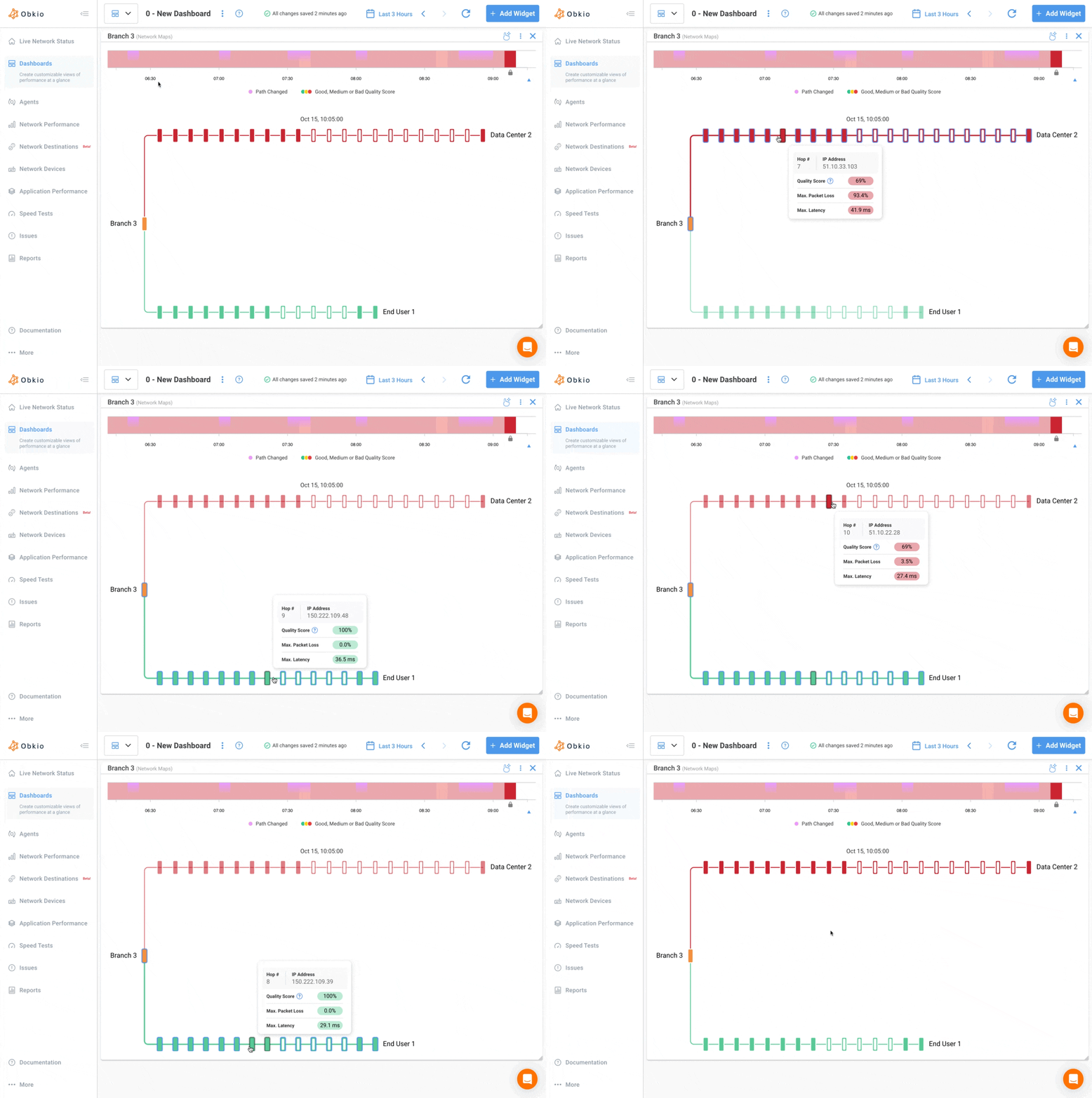
Obkio's Visual Traceroutes also include Network Map graphs.
The Network Map displays all network paths from one source agent to multiple destination agents. Each discovered path is displayed, with hop counts and related IPs clearly labelled, giving you a colour-coded view of packet loss, latency, number of hops, and all alternate routes in one place.
The Network Maps can also be added as widgets to dashboards.

Obkio's Visual Traceroutes use fixed settings and cannot be modified by the user. The default parameters are:
- Display:
IP + Hostname– shows both the IP address and reverse DNS name of each hop. - Interval:
1.2 second– time between probes. - Max TTL:
30– maximum number of hops. - Packet Size:
64 bytes– size of the ICMP packet. - Protocol:
ICMP– Visual Traceroute uses ICMP echo requests.
View our Visual Traceroute Product Page


