Table of Contents
Table of Contents
Obkio’s Network Monitoring SaaS app was born from a need within the industry to simplify network performance monitoring for modern, decentralized networks. What are some of Obkio’s features, and how can you use Obkio to troubleshoot network problems? We’re showing you how in this network monitoring app tour - told through screenshots.
Obkio Network Performance Monitoring software is a simple Network Monitoring and Troubleshooting SaaS solution designed to monitor end-to-end network performance from the end user perspective, and to fulfil the need within the industry for a solution that simplified Performance Monitoring.
Obkio leverages Network Monitoring Agents and synthetic traffic to continuously identify the causes of intermittent VoIP, video, and applications slowdown in seconds - and collect the data you need to troubleshoot and ultimately improve the end-user experience.
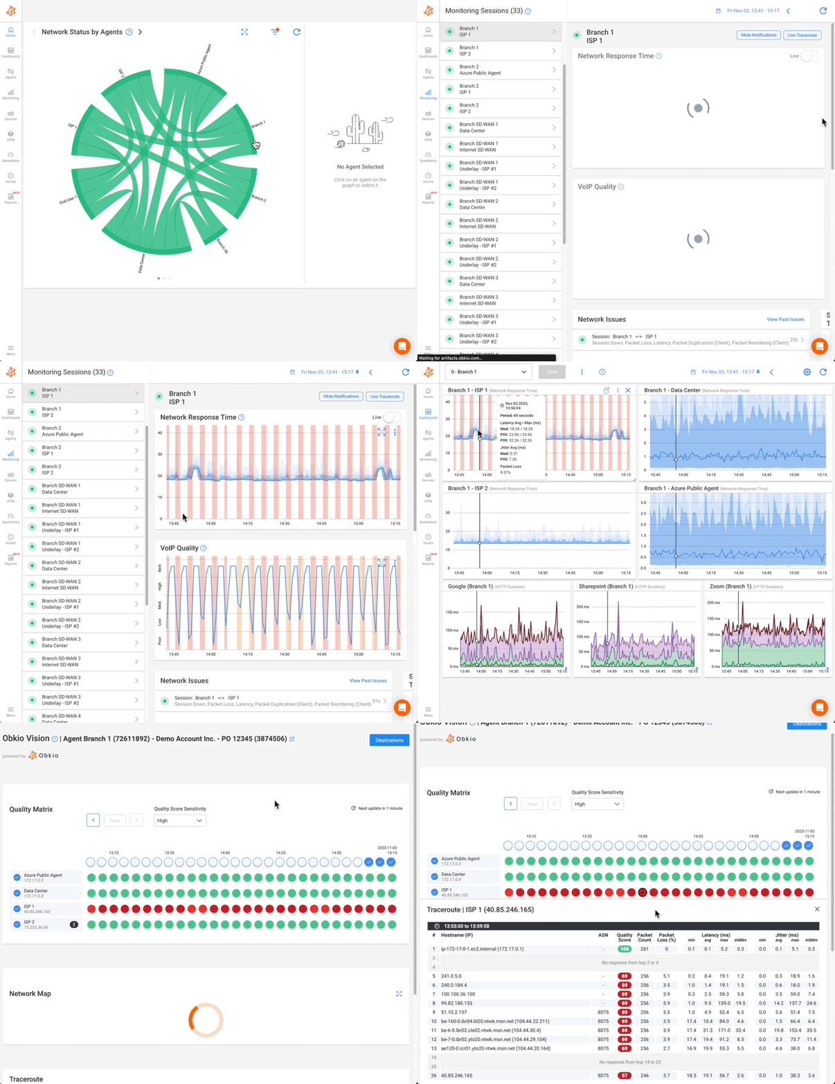
Learn more about Obkio’s features.

Obkio’s solution consists of deploying physical or software network performance monitoring Agents at strategic locations in a company's offices or network destinations such as data sites, remote sites, external client sites, or public or private clouds. Once agents are deployed, they exchange synthetic traffic between each other every 500 ms intervals to continuously test and monitor network performance. Although it may sound like a lot, this is a very small volume of traffic generating only a few kbps per session.
Obkio continuously tests and measures different operating parameters based on network metrics, such as latency, jitter, packet loss, quality of service and customer experience via the QoE (Quality of Experience) and performs speed tests regularly to check whether the data available coincides well with what should be offered by service providers.
Obkio’s application includes a sleek and personalized dashboard that allows users to have real-time access to the health status of the performance of the network. Check the performance between your offices and data centers in real-time, right from your dashboard.
The app alerts you as soon as a problem occurs or even if there are signs that a failure is about to happen. Not only does it alert you and pinpoint the source of the issue, but it also allows you to go back in time to complete a diagnosis.
To make this app tour as fun as easy to understand as possible, we’ll be using screenshots to tell a story. If you'd like an introduction to our app before diving in to the detailed app tour, check out our demo below!
The story is a use case for network troubleshooting, using Obkio’s network monitoring app and features. This story features a fictional Network Admin and company trying to troubleshoot a network problem related to VoIP in their branch office.
P.S. You can always book a demo with our team for a real-time app tour!
It’s 7:00 AM on a weekday.
A Network Admin, let’s call her Alice, is contacted by her company’s support team because users from the company’s Branch 50 have been complaining about network performance issues related to voice and video calls since that morning.
To get a better picture of what’s going on, Alice connects to Obkio’s Network Monitoring Web Application and lands on the Homepage.
This is what she sees:
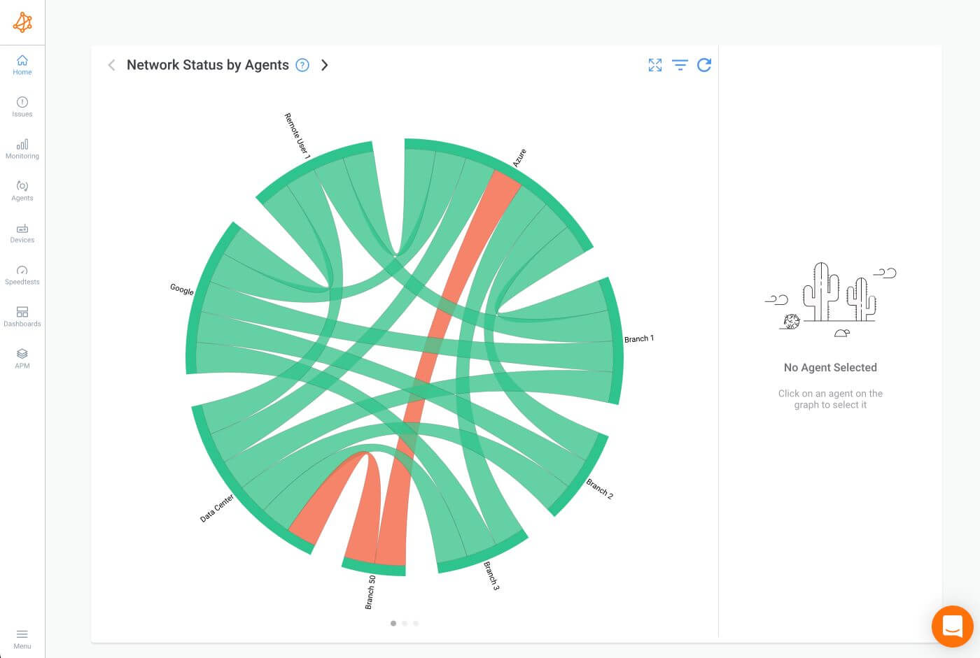
The home page displays Obkio’s Chord Diagram, which showcases the live performance of all the branches where Obkio's Monitoring Agents have been deployed. The Chord diagram visually represents the live network status across all monitored paths.
Obkio's Monitoring Agents are software or hardware components strategically deployed across different network locations to continuously monitor network performance. These agents are designed to simulate user traffic and gather real-time data on various network performance metrics.
Deployment: Monitoring Agents can be deployed in various network locations, such as on-premises data centers, branch offices, cloud environments, or even remote user sites. They can be installed on physical devices or as virtual instances, making them highly flexible and adaptable to different network setups.
Synthetic Traffic Generation: The agents generate synthetic traffic, mimicking real user activity without impacting actual user data. This traffic includes various types of packets, such as UDP, to simulate typical network usage and measure performance accurately.
Network Path Monitoring: By establishing monitoring sessions between each other, the agents create a mesh network of monitored network paths. These paths are the routes taken by the synthetic traffic, and the agents continuously measure the performance of these routes.
Performance Metrics: The Monitoring Agents collect data on key performance metrics, including latency, jitter, packet loss, and throughput. This data provides insights into the health and performance of the network.
Here, the chord diagram dynamically displays the real-time status of network connections, where monitoring agents have been deployed.
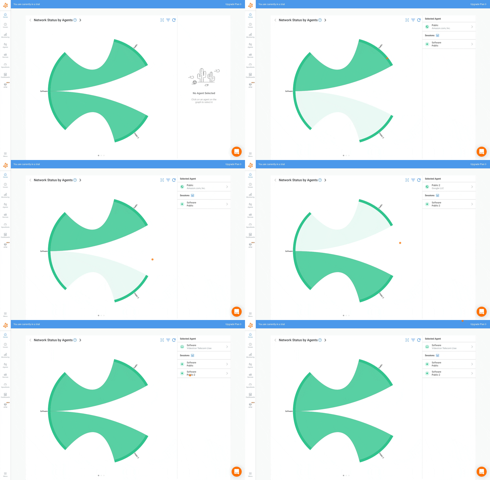
Here's a detailed breakdown of how it works:
Interactive Chord Diagram: The homepage showcases a colorful, circular chord diagram that connects various network nodes. Each node represents a location where a monitoring agent is deployed.
Network Paths: The lines or "chords" between the nodes indicate the network paths being monitored. These paths are established by creating monitoring sessions between the agents.
Real-Time Status: The chord diagram is updated in real-time, providing instant visibility into the health of each network path. It uses color coding to differentiate between healthy paths and those experiencing issues.
Instant Insights: At a glance, users can quickly identify which network paths are functioning correctly and which are encountering problems. This immediate visual feedback is crucial for rapid troubleshooting.
Drill-Down Capability: Users can interact with the diagram by clicking on any network path that shows issues. This action opens a detailed view, allowing users to dive deeper into the specific problems affecting that path, such as latency, packet loss, or other network performance metrics.
This intuitive and visually engaging representation on Obkio's homepage enables users to efficiently monitor and manage their network performance, ensuring they can promptly address any issues that arise.
Looking at the Chord Diagram, Alice notices that the performance at Branch 50 is being affected.
She selects the Branch 50 Monitoring Agent to focus only on this Monitoring Agent and see the related Monitoring Sessions.
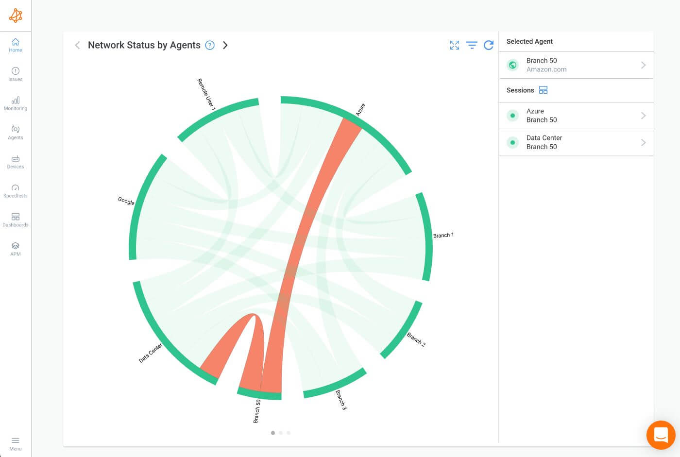
The red status on both monitoring sessions indicates a performance issue on the UDP packets generated and exchanged between the Monitoring Agents to measure the network performance. For example, UDP packet loss.
A problem is definitely happening at this branch location!
Obkio utilizes synthetic traffic to monitor performance, meaning that the agents continuously exchange synthetic UDP traffic between each other. This synthetic traffic mimics real network usage without impacting actual user data, allowing for precise measurement of various performance metrics.
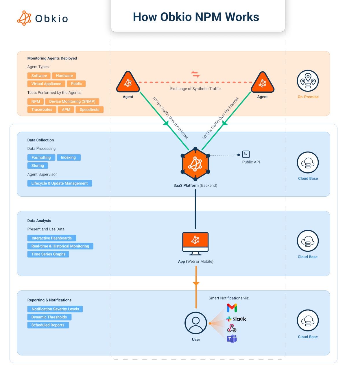
The red status alerts users to potential issues such as high latency, packet loss, or jitter in the synthetic traffic flow, providing a clear indication that the network path is experiencing problems. This ensures that users can quickly identify any network performance degredation at at a glance, and understand where exactly it's happening.
To drill-down even further in Obkio’s Network Monitoring app, Alice selects the monitoring session between the Branch 50 and Data Center Agents and is brought to the Network Session Page.
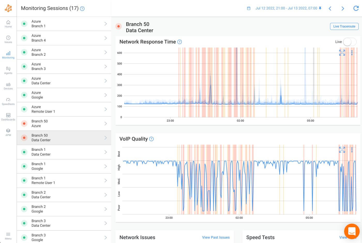
This page shows mainly two graphs: Network Response Time and the VoIP Quality for the past 10 hours.
The Network Response Time Graph shows raw network metrics like Packet Loss (via the yellow and red columns in the graph), Latency (via the solid blue line) and Jitter (via the different shades of blue around the solid blue line).
Packet Loss: Represented by the yellow and red columns in the graph, packet loss indicates the percentage of packets that fail to reach their destination. High packet loss can severely impact network performance and application reliability.
Latency: Indicated by the solid blue line, latency measures the time it takes for a packet to travel from the source to the destination. Lower latency is crucial for real-time applications like VoIP and video conferencing.
Jitter: Shown by the different shades of blue around the solid blue line, jitter measures the variability in packet arrival times. High jitter can cause issues in applications requiring steady data flow, such as VoIP and video streams.
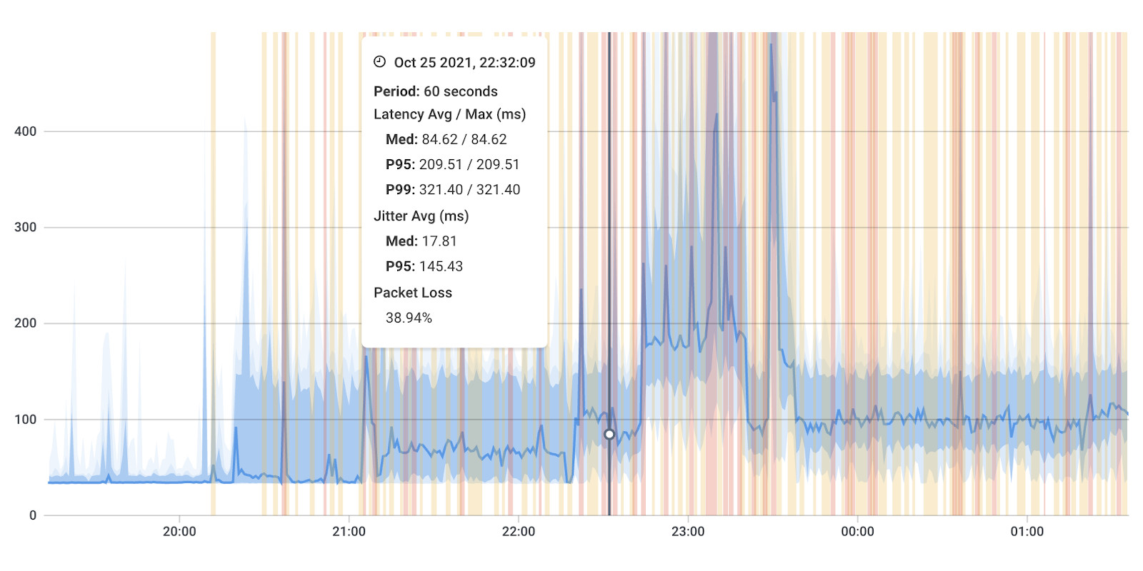
The Network Response Time Graph provides a minute-by-minute breakdown of these metrics, helping users to quickly identify any anomalies or trends over the past 10 hours. This detailed visibility is essential for diagnosing and troubleshooting network issues effectively.
The VoIP Quality Graph leverages the data from the Network Response Time Graph to measure the Mean Opinion Score (MoS), which is a key indicator of VoIP call quality. The MoS score provides a user-centric view of how network performance affects voice communications.
MoS Score: The VoIP Quality Graph calculates the MoS based on metrics like latency, jitter, and packet loss. This score ranges from 1 to 5, with higher scores indicating better call quality. A MoS score above 4 is generally considered good, while a score below 3 may indicate poor call quality.
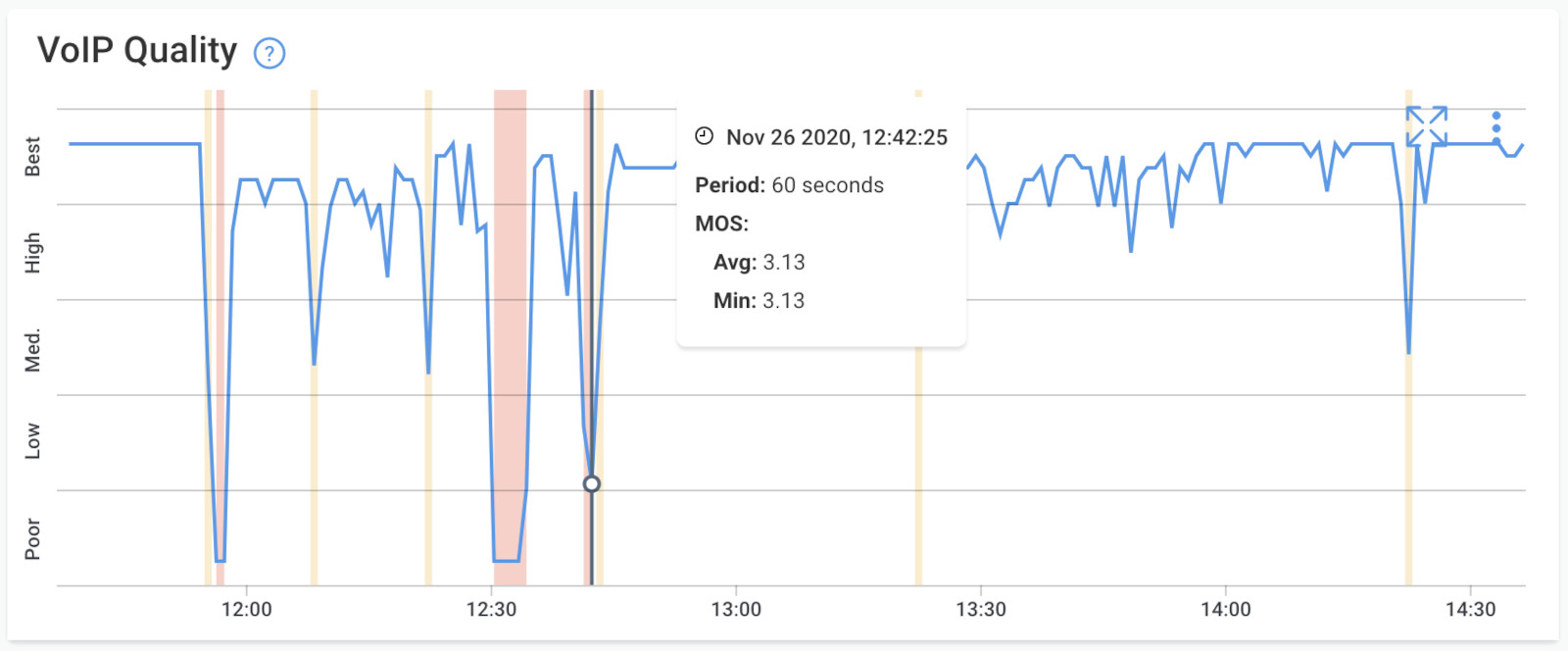
The graph provides visibility on the call quality for users located in Branch 50, helping network administrators to pinpoint issues affecting specific locations. The graph shows two episodes of significant packet loss. One from around 23:00 to 2:00 and another that started around 6:00 and is still going on.
On Obkio's Network Session Page, users have a comprehensive view of their network's performance. This page offers detailed insights into network behavior and allows for both real-time and historical analysis. Here’s how it works:
Minute-by-Minute Results: Users can view network performance results on a minute-by-minute basis. This granular level of detail provides a precise understanding of how the network is performing at any given moment, making it easier to identify specific times when issues occurred.
Historical Analysis: The Network Session Page also allows users to go back in time and examine past performance data. This feature is invaluable for diagnosing intermittent issues, understanding trends, and performing post-incident analysis. Users can select specific time periods to review performance metrics and correlate them with other network events.
Live Performance Monitoring: For real-time insights, users can click the "Live" button. This feature provides a current snapshot of network performance, updating continuously to reflect the most recent data. Live monitoring is crucial for immediate troubleshooting and ensures that any emerging issues are detected and addressed promptly.

By offering both detailed historical data and real-time monitoring, Obkio's Network Session Page equips users with the tools needed to maintain optimal network performance and swiftly respond to any issues.
Back on the app’s Home Page, Alice creates a Dynamic Dashboard from the Data Center point of view.

By comparing the information, Alice notices that only Branch 50 is experiencing over 11% packet loss.
The other locations don’t follow this pattern, which confirms that the issue is not on the Data Center side.
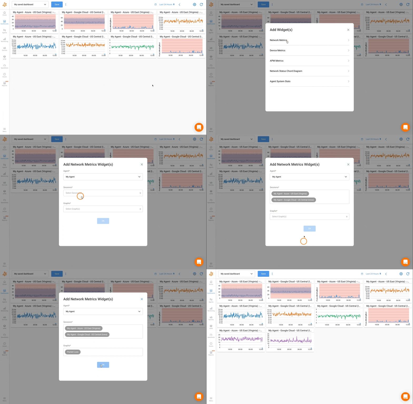
Dynamic dashboards are a way to generate a dashboard with a predefined list of widgets common to something specific. Dynamic dashboards are available, from many location in the application, via a dashboard blue icon.
The screenshot below shows you how you can create a dynamic dashboard:

While the dynamic dashboards does starts with some widgets already, users can customize their view by adding and arranging widgets according to their preferences and monitoring needs. This flexibility ensures that users can focus on the most relevant metrics and data points for their specific use cases.
The Dynamic Dashboard is designed with an intuitive and user-friendly interface, making it accessible to both technical and non-technical users. This ease of use enhances the overall user experience and facilitates efficient network management.
Alice goes back again to the home page, but this time, she builds a Dynamic Dashboard from Branch 50’s perspective.
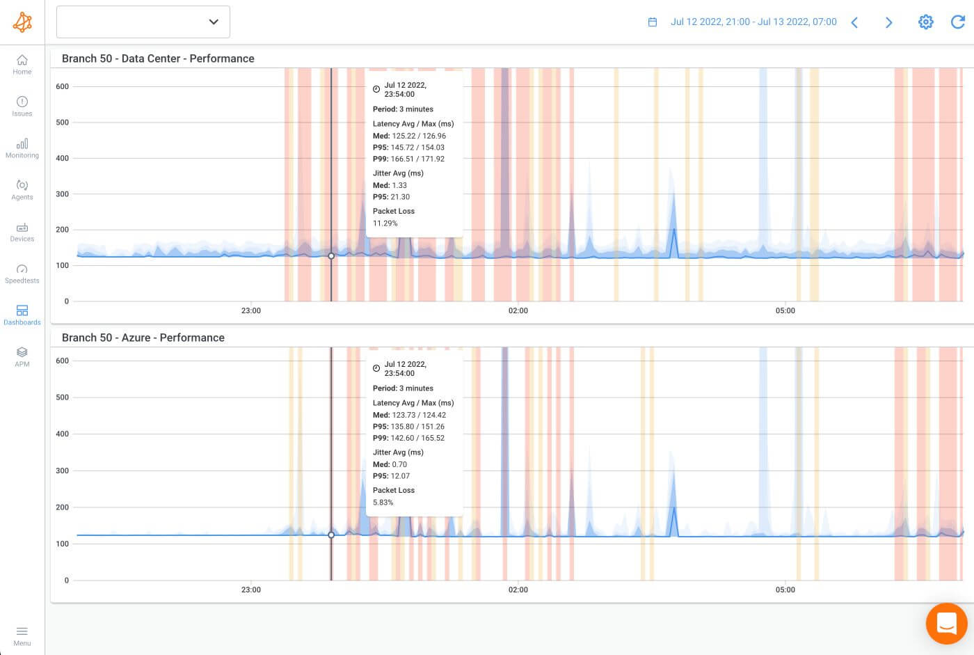
The network monitoring graph between Branch 50 and the Data Center shows 11% packet loss, and the graph from Branch 50 to the Microsoft Azure Public Monitoring Agent (provided by Obkio and reachable via Internet) shows the same thing.
Since the same pattern is happening on both monitoring sessions, the performance issue is clearly located on Branch 50’s end.
Now that she knows that the network problem is happening with Branch 50, Alice selects the predefined dashboard she built before the incident specifically for Branch 50, which shows the branch’s network health at a glance.
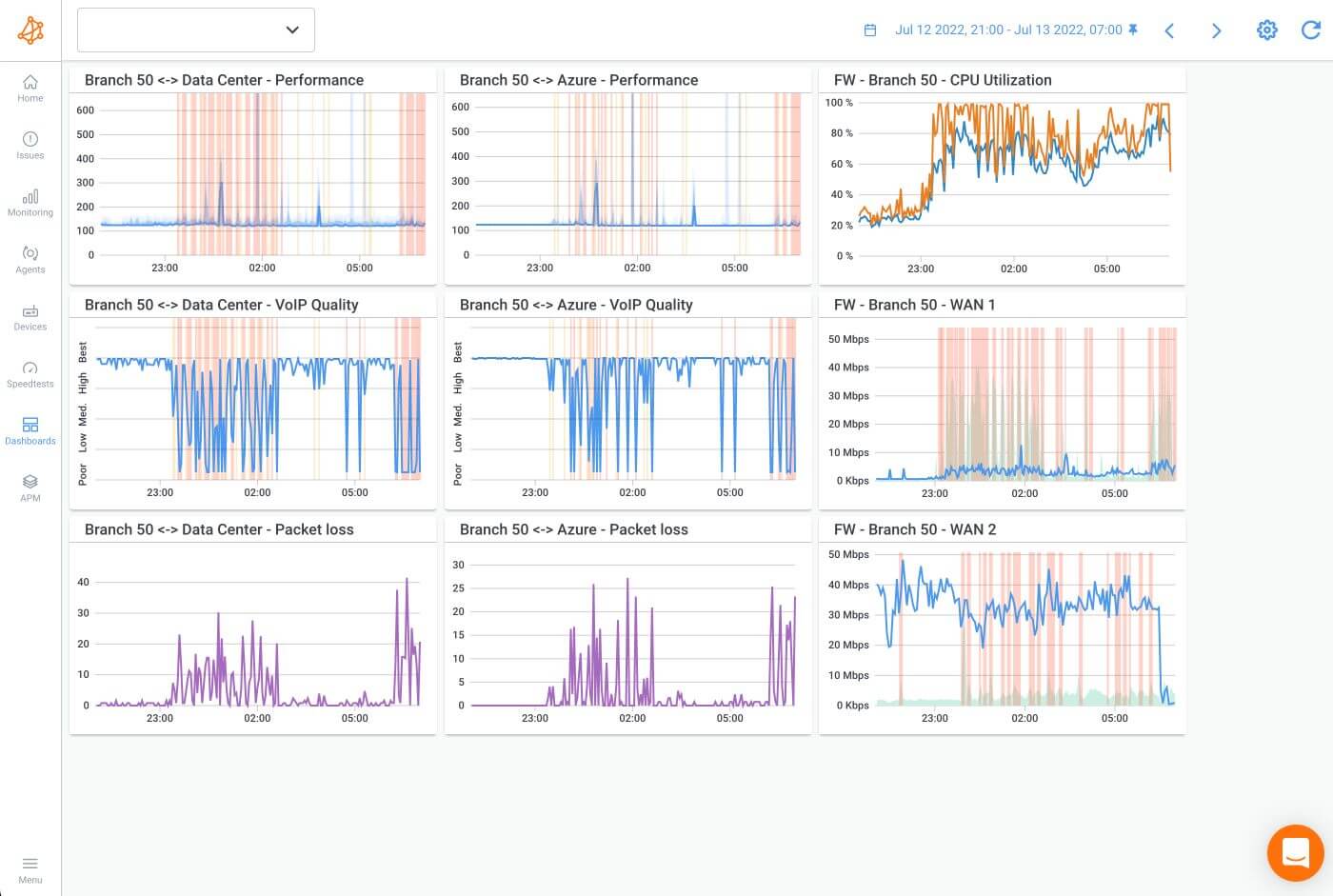
The dashboard includes:
- The network performance graphs towards the Data Center and Microsoft Azure Agents
- The related VoIP Quality and Packet Loss graphs to these destinations
In this case, Alice is viewing a dashboard that she built from scratch before the incident.
Users can easily build and customize network monitoring dashoards in Obkio's app as they please. These dashboards consolidate various network metrics and monitoring data into a single, user-friendly interface, allowing for efficient monitoring, troubleshooting, and optimization of network operations.
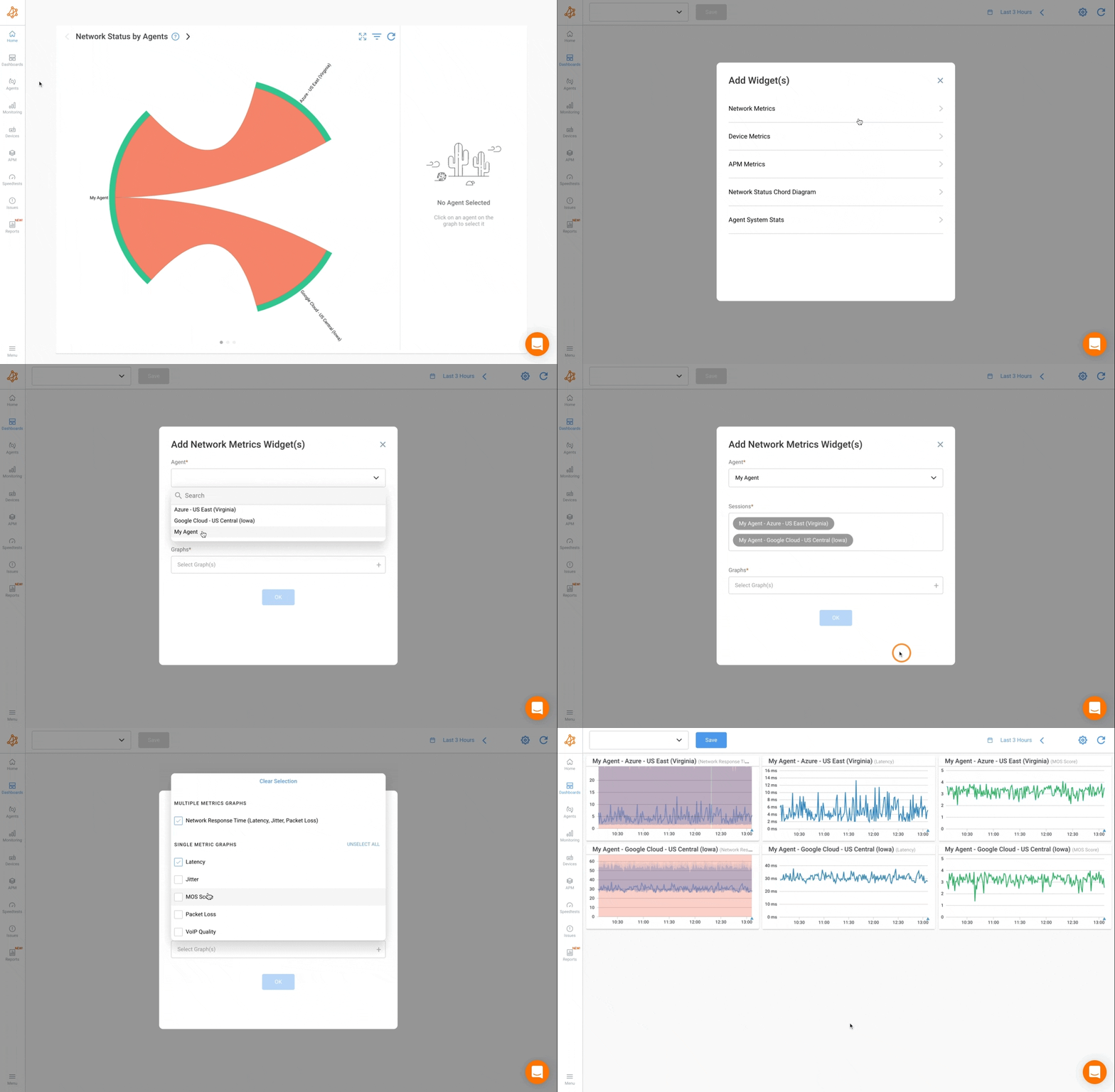
Check out our documentation for more information about customizing dashboards.
The graphs on the last column in the dashboard catch Alice's eye. The graphs provide data from SNMP polling, done from the Branch 50 Agent to the Branch 50 SD-WAN Firewall showing CPU and bandwidth usage on both WAN ports.
An increase in bandwidth usage on WAN port 1 and high CPU usage is happening simultaneously with each packet loss test.
Obkio’s Network Device Monitoring feature Obkio's SNMP Network Device Monitoring feature is designed to provide detailed insights into the performance of network devices using the Simple Network Management Protocol (SNMP). This feature enables users to monitor essential metrics such as CPU usage and bandwidth utilization, which are critical for maintaining the health and efficiency of network infrastructure.

SNMP Polling: Obkio uses SNMP polling to gather performance data from network devices. SNMP is a widely used network monitoring protocol that allows for the collection and organization of information about managed devices on IP networks. Through SNMP polling, Obkio can retrieve various performance metrics from devices such as routers, switches, firewalls, and more.
Comprehensive Metrics: The SNMP monitoring feature collects a range of metrics that provide a clear picture of device performance. Two key metrics monitored are CPU usage and bandwidth utilization:
CPU Usage: This metric shows the percentage of CPU resources being used by the network device. High CPU usage can indicate that the device is under heavy load, which may lead to performance degradation or even device failure if not addressed promptly.
Bandwidth Utilization: This metric indicates the amount of data being transmitted and received by the network device over a specified period. Monitoring bandwidth utilization helps in understanding network traffic patterns and identifying potential bottlenecks.
Alice concludes the Firewall is not able to properly digest the amount of traffic and is missing CPU, thus dropping a lot of packets.
She logs into the Firewall and finds a source IP using a significant amount of bandwidth to perform file transferring.
She applies a rate limiting rule for file transfers, thus significantly reducing the bandwidth and CPU usage of the Firewall, solving the issue for now.
After solving the issue, she continues to review the data collected from the application. At this point, it’s time for some serious network troubleshooting, so she decides to use Obkio Vision, Obkio’s advanced Visual Traceroute tool.
Obkio Vision is a visual traceroute tool and IP route historic monitor created by Obkio that runs continuously to interpret Traceroute results for you and help troubleshoot network problems (in your WAN and over the Internet) faster and easier than ever. It can be used as a standalone tool, or within Obkio's complete Network Monitoring App.
The visual traceroute tool includes 3 key components.
1. The Quality Matrix: Obkio Vision’s graphical diagram monitors multiple network destinations during a span of 3 hours. IP addresses can be used as destinations such as SaaS Websites, network devices, etc.
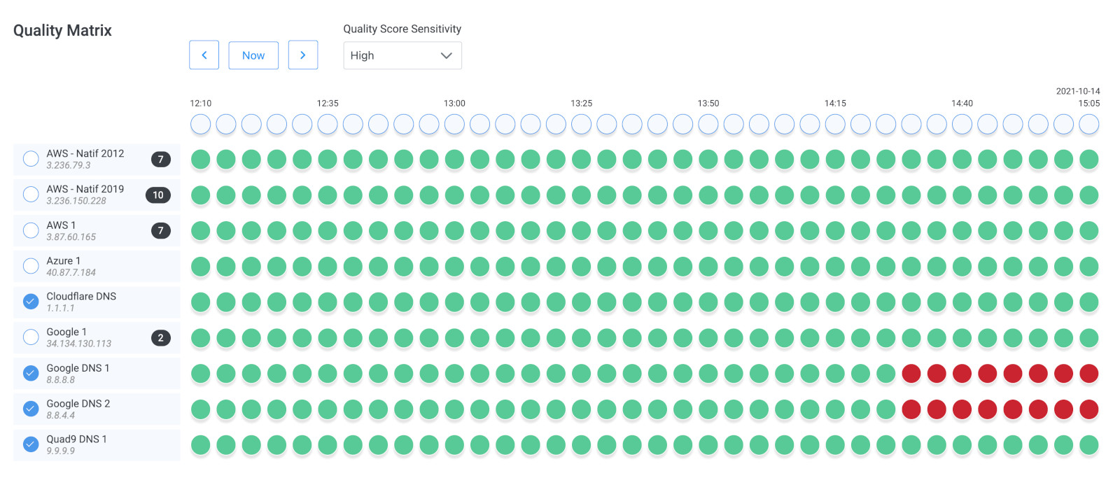
2. Network Map: The network map shows a visual representation of each network path to their destinations. Each router displays its own Quality Score to help pinpoint where network issues are located. Users can also see history and route changes/flapping to troubleshoot past intermittent network issues or outages.
3. Traceroutes: Obkio Vision includes Obkio’s modern Traceroute feature to measure hop-by-hop core network metrics like packet loss, latency and jitter with wide time ranges (from 5 minutes to 3 hours).

At this point, Alice creates a Network Map and runs Traceroutes for the Branch 50 Agent.
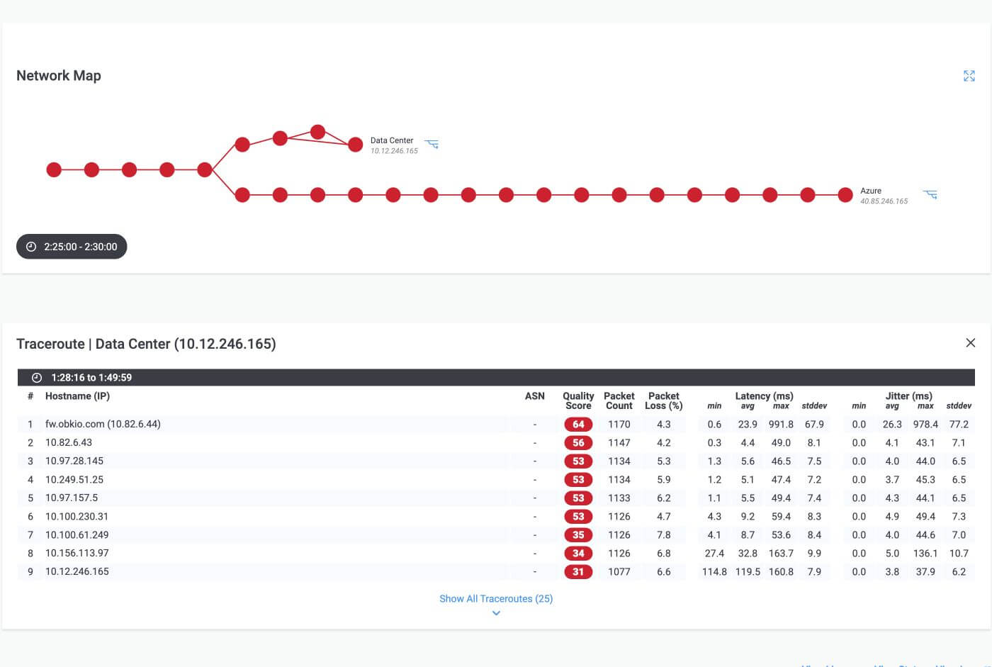
By looking at the Network Map and Traceroute results, the network admins confirm that the packet loss was starting right from the SD-WAN Firewall.
It is also clear from the traceroutes that the Firewall is also replying to the ICMP packets with significant high latency and jitter compared to the other hops along the way.
She confirms that something is wrong with the network equipment from this point of view.
Alice then goes to the configurations for Obkio’s Network Monitoring app and looks at the Network Monitoring Thresholds used for raising alerts for network issues.
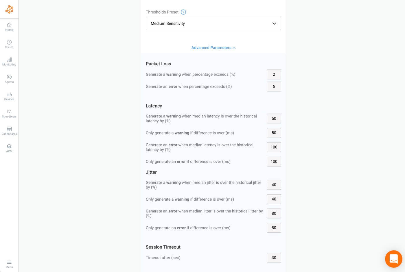
The sessions are configured to trigger a warning issue for over 2% packet loss and an error issue for over 5% packet loss, corresponding to the yellow and red columns seen in the previous graphs.
There are also latency and jitter thresholds in place to raise issues regarding these metrics.
Every 60 seconds, the a Monitoring Agent sends the network metric measurements to the Obkio Cloud. When received, the measurements are analyzed and Network Issues can be raised based on the thresholds. Once the Networks Issues are raised, Smart Notifications are used to send emails to the App users.
It's not always trivial to choose the thresholds used to raise network issues. Depending on the locations, their importance for the business and the technology in place (fiber, cable, dsl, satellite), not all thresholds should be configured the same.
This is why we have Threshold Presets that are ready to use as default values. Metrics like latency and jitter use Dynamic Thresholds, which are based on a historical baseline to avoid adjusting thresholds for each monitoring session.
Threshold Presets
To make it easier to configure thresholds, three presets of thresholds are available to use. These presets suit the majority of our customers' use cases, but custom thresholds are always available. The presets are:
- High Sensitivity
- Medium Sensitivity (default)
- Low Sensitivity
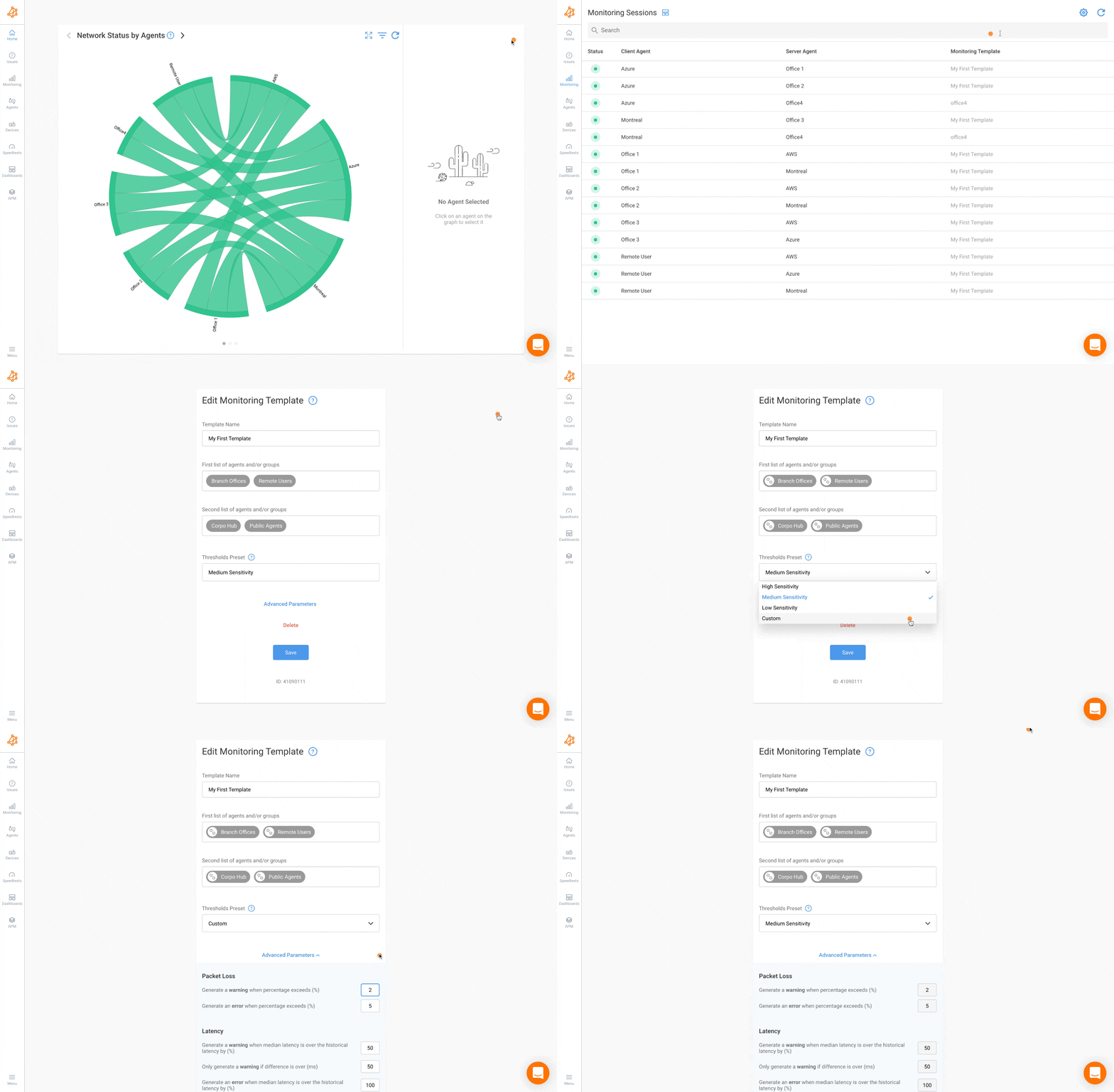
The more sensitive the thresholds are, the more likely they are to trigger a Network Issue in the App if metric measurements change from the historical network baseline.
Alice wonders if she was notified of the network issue. She looks at her inbox and confirms she received an email notification highlighting the packet loss on both sessions when the first episode started around 23:00.
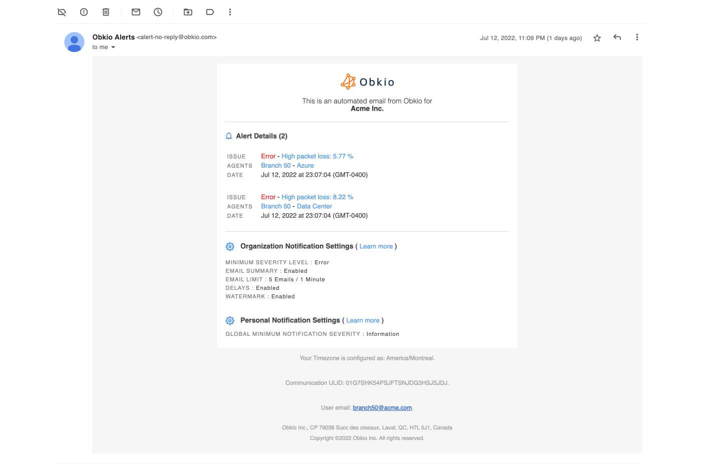
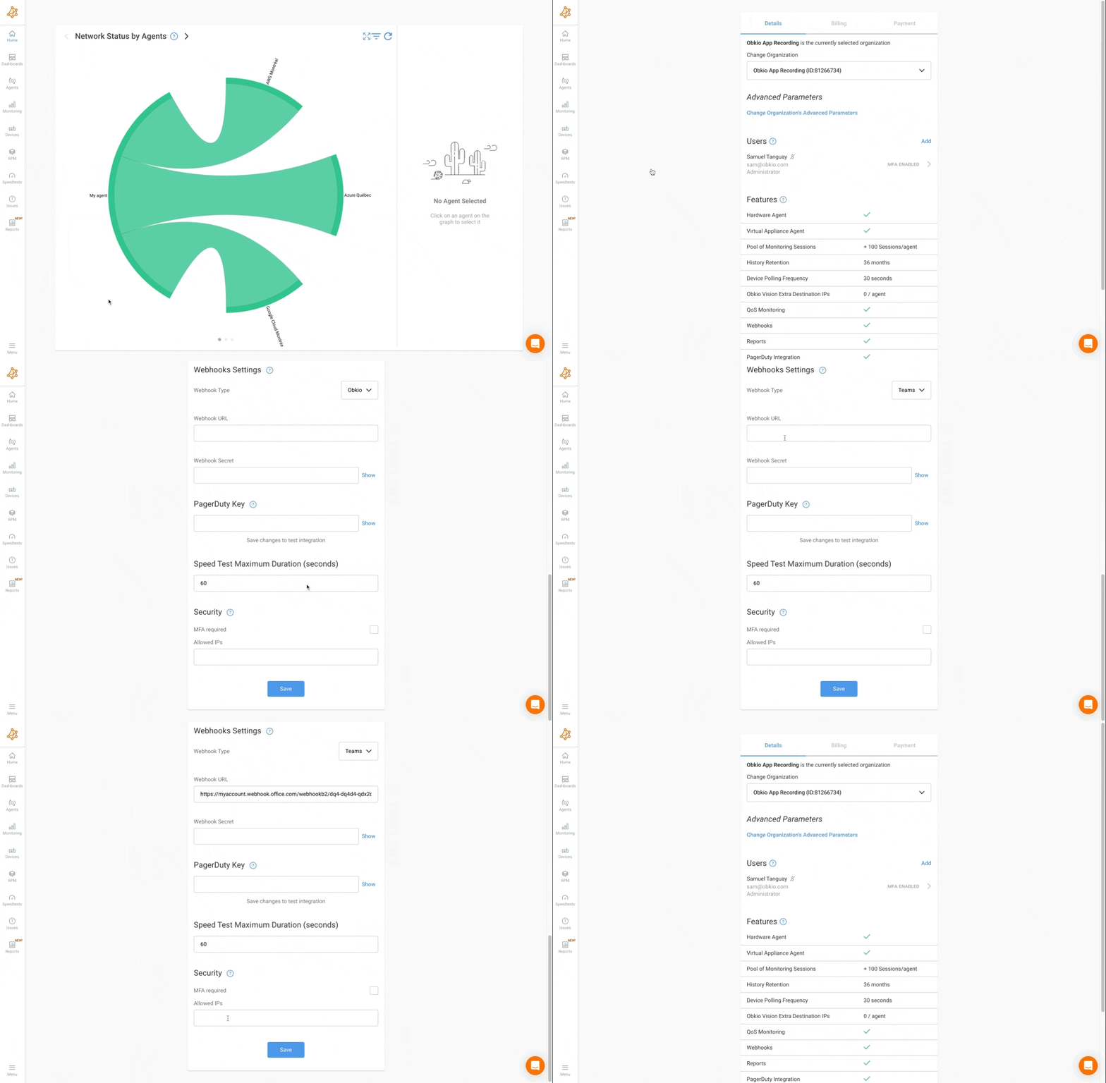
Notifications are sent to users when something changes within their network and requires attention. They can be raised because a Network Issue is detected (such as high packet loss) or when a Network Device is offline. Notifications are either sent by email, using Pagerduty, or with webhooks via Slack or Microsoft Teams.
They can be based on different severity levels, which are configurable from the Advanced Parameters section of the Network Monitoring Template. They can be configured based on Severity Level, Session Timeout, and Packet Loss, Latency, and Jitter levels.
A severity level is applied for each triggered event and the notification created is based on those severity levels. The following is the list of possible severity levels:
- Ok (level 0)
- Information (level 1)
- Warning (level 2)
- Error (level 3)
- Critical (level 4)
Obkio sends smart notifications (which groups events together) to reduce notification overload and emphasize important events. The notifications can be received through:
- Email (sent to the user email address from the address alert-no-reply@obkio.com)
- PagerDuty Events API v2
- Obkio Webhook
- Microsoft Teams
- Slack
Now that you’ve had a sneak peak of Obkio’s Network Monitoring App including features, and how to identify and troubleshoot network problems, it’s time to start for real.
With the rise of SD-WAN and Cloud infrastructures, our reliance on a high functioning network is more important than ever. Network Monitoring helps you ensure that your network is performing at its best.
Put It to the Test: Trying Is the Ultimate Way to Learn!
Networks may be complex. But Obkio makes network monitoring easy. Monitor, measure, pinpoint, troubleshoot, and solve network problems.
- 14-day free trial of all premium features
- Deploy in just 10 minutes
- Monitor performance in all key network locations
- Measure real-time network metrics
- Identify and troubleshoot live network problems




 Obkio Blog


