


Table of Contents
Table of Contents
Tired of endless data and complex graphs? Learn what network visualization is and how network monitoring helps you achieve it to visualize your network.
Networks are the backbone of business operations, connecting everything from data centers and office branches to cloud services and remote workers. As these networks grow increasingly complex, managing, maintaining and understanding the various flows of traffic in larger networks becomes a significant challenge for many companies.
Enter network visualization: a powerful approach that transforms intricate network data into clear, intuitive visual representations, making it easier for administrators to understand, manage, and optimize their networks. In this article, we'll be explaining what it is and how it works, as well as how network visualization and network monitoring can work hand in hand. Let’s dive in!
What is Network Visualization? 
Network visualization, sometimes referred to as graph visualization or link analysis, involves the graphical representation of networks, illustrating connections between various entities as links and nodes. Nodes symbolize data points or devices within the network, while links depict the interactions or pathways connecting these points. The goal of network visualization is to help network administrators grasp and manage intricate network structures with greater ease, while helping them understand the flow of traffic


The Importance of Network Visualization in Modern Networks
Networks are becoming increasingly complex with numerous devices, data centers, distributed offices and intricate connections. That’s why network visualization plays a crucial role in managing these complexities by providing a clear, graphical representation of the network.
This visualization aids in:
Quickly Identifying Network Issues and Performance Bottlenecks: By visualizing the network, administrators can pinpoint where issues are occurring, whether it's a specific device, data center or a particular connection. This immediate insight is critical for fast resolution of problems, minimizing downtime and maintaining optimal network performance.
Enhancing Overall Network Management and Performance Monitoring: A visual representation of the network allows for easier monitoring and management. Administrators can see the status of different network components at a glance, making it simpler to oversee network health and performance.
Simplifying Understanding of Network Structures for Both Technical and Non-Technical Stakeholders: Network visualization translates complex network data into a more comprehensible and visual format. This not only helps network engineers and IT pros but also makes it easier for non-technical team members, such as senior management or other departments, to understand the network’s structure and its operational status. You can also incorporate this visual data into presentations, effectively communicating network insights to stakeholders with ChatGPT for presentations.
With this foundational understanding of what network visualization is and its importance, we can delve deeper into the key concepts and components that make up effective network visualization in the next section.
What are the Key Components of Network Visualization?
Network visualization is built on several key concepts and components that work together to create a comprehensive and intuitive visual representation of a network.
Key Concepts and Components
These include:
- Nodes: Represent individual devices or data points within the network. Each node can have various attributes, such as type, status, and performance metrics.
- Links: Indicate the connections between nodes, illustrating the pathways through which data travels. Links can represent physical connections (like cables) or logical connections (such as data flows).
- Topology: The arrangement or mapping of elements (nodes and links) in centralized and distributed networks. Topology maps show how different components are interconnected and can vary in complexity from simple star topologies to intricate mesh topologies.
- Metrics: Data points that provide information about the performance and status of network components. Metrics can include bandwidth usage, latency, error rates, and device health.

Types of Network Visualization
There are various types of network visualization, each serving a specific purpose in network management:
- Topology Maps: Provide an overview of the network structure, showing how devices are interconnected. They help in understanding the layout and identifying potential points of failure.
- Traffic Flow Diagrams: Illustrate the flow of data through the network, highlighting paths taken by data packets. These diagrams are useful for analyzing traffic patterns and identifying bottlenecks.
- Heatmaps: Use colour-coding to represent different metrics, such as bandwidth usage or signal strength. Heatmaps help in quickly identifying areas with high or low performance.
- Node-Link Diagrams: Show nodes as points and links as lines connecting them. These diagrams are useful for visualizing relationships and interactions within the network.
What are the Benefits of Network Visualization?
Network visualization offers numerous benefits that enhance network management and operations:
- Enhanced Network Performance Management: By providing a clear view of network performance metrics, visualization helps administrators monitor and manage network health more effectively, ensuring optimal performance.
- Improved Troubleshooting and Issue Resolution: Visualization tools make it easier to identify and locate issues within the network, speeding up the troubleshooting process and minimizing downtime.
- Increased Network Security and Compliance: Visual representations of the network help in monitoring security events and ensuring compliance with regulatory standards by providing a clear view of security-related metrics.
- Better Capacity Planning and Resource Allocation: Visualization aids in understanding current resource usage and predicting future needs, helping in efficient capacity planning and resource allocation.

Learn about network performance monitoring to optimize network performance. Discover key network metrics, tools & techniques & the benefits for businesses.
Learn moreThe Most Intuitive Network Topology Visualization Tool
Effective management and troubleshooting of network infrastructure rely heavily on understanding its performance and structure. While dedicated network visualization tools are valuable for visual representation, they often lack comprehensive monitoring capabilities.
This is where network monitoring tools become crucial, offering dynamic real-time maps that detail device statuses, connectivity, and data flow. This approach not only enhances visibility but also streamlines the identification and resolution of network issues, ensuring optimal performance and management.
Obkio Network Performance Monitoring software is a user-friendly SaaS solution designed to simplify network monitoring and troubleshooting from the end-user perspective. Recognizing the industry's need for a straightforward performance monitoring tool, Obkio provides powerful visualization features that make network management more accessible and effective.

Put It to the Test: Trying Is the Ultimate Way to Learn!
- 14-day free trial of all premium features
- Deploy in just 10 minutes
- Monitor performance in all key network locations
- Measure real-time network metrics
- Identify and troubleshoot live network problems


Continuous Monitoring with Network Monitoring Agents
Obkio employs Network Monitoring Agents, which can be deployed across various network locations, including on-premises data centers, branch offices, cloud environments, and remote user sites. Monitoring agents are essential for understanding your network’s flow and for visualizing its structure. These agents can be installed on physical devices or as virtual instances, offering flexibility and adaptability to different network setups.

- Synthetic Traffic Generation: The agents generate synthetic traffic that mimics real user activity without impacting actual user data. This traffic includes various packet types, such as UDP, to accurately measure network performance.
- Network Path Monitoring: Monitoring sessions between agents create a mesh network of monitored paths. These paths represent the routes taken by synthetic traffic, and the agents continuously measure the performance of these routes.
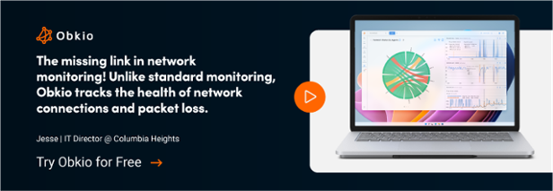
Real-Time Network Visualization with the Chord Diagram
A standout feature of Obkio is its interactive Chord Diagram, prominently displayed on the homepage. This dynamic, circular diagram visually represents the live performance of all network paths monitored by Obkio's agents.

Here’s how it enhances network visualization:
- Interactive Chord Diagram: The homepage showcases a colourful, circular chord diagram that connects various network nodes. Each node represents a location where a monitoring agent is deployed.
- Network Paths: The lines or "chords" between the nodes indicate the network paths being monitored. These paths are established by creating monitoring sessions between the agents.
- Real-Time Status: The chord diagram is updated in real-time, providing instant visibility into the health of each network path. It uses colour coding to differentiate between healthy paths and those experiencing issues.
- Instant Insights: At a glance, users can quickly identify which network paths are functioning correctly and which are encountering problems. This immediate visual feedback is crucial for rapid troubleshooting.
- Drill-Down Capability: Users can interact with the diagram by clicking on any network path that shows issues. This action opens a detailed view, allowing users to dive deeper into the specific problems affecting that path, such as latency, packet loss, or other key network performance metrics.
Key Network Performance Metrics
Obkio’s Monitoring Agents collect data on essential performance metrics, including latency, jitter, packet loss, and throughput. This data provides valuable insights into the network’s health and performance, enabling users to:
- Proactively Manage Network Performance: With real-time and historical data at their fingertips, users can identify trends and potential issues before they impact the network.
- Efficiently Troubleshoot Issues: The visual and detailed performance data allows for quick identification and resolution of network problems, minimizing downtime.
- Optimize Network Resources: Understanding performance metrics helps in better capacity planning and resource allocation, ensuring optimal network efficiency.
Obkio Vision: Your Simple Network Visualization Tool
Obkio Vision is a visual traceroute tool and IP route historic monitor designed by Obkio to streamline the troubleshooting of network problems across WAN and Internet connections. This tool runs continuously to interpret traceroute results, making it faster and easier than ever to resolve network issues. Obkio Vision can be used as a standalone tool or integrated within Obkio's comprehensive Network Monitoring App.

Key Components of Obkio Vision:
1. The Quality Matrix
Obkio Vision features a graphical Quality Matrix that monitors multiple network destinations over a three-hour span. Users can set IP addresses as destinations, including SaaS websites and network devices. This visual diagram provides a quick overview of network performance, helping users identify issues with ease.

2. Network Map
The Network Map provides a visual representation of each network path to its destinations. Each router along the path is displayed with its own Quality Score, enabling users to pinpoint where network issues are located. Additionally, users can view the history and detect route changes or network flapping, which aids in troubleshooting past intermittent network problems or network outages.

3. Traceroutes
Obkio Vision includes a modern traceroute feature that measures hop-by-hop core network metrics such as packet loss, latency, and jitter over various time ranges (from five minutes to three hours). This detailed data allows for precise analysis of network performance at each hop, facilitating effective troubleshooting and optimization.

Simplifying Network Troubleshooting with Obkio Vision
Obkio Vision transforms the traditionally complex process of network troubleshooting into a straightforward and efficient task. By leveraging its visual traceroute capabilities, users can quickly interpret network paths, identify problematic hops, and understand the quality of each segment of their network.
- Continuous Monitoring: Obkio Vision runs continuously, providing up-to-date information that reflects the current state of the network.
- User-Friendly Visuals: The graphical representations, such as the Quality Matrix and Network Map, offer an intuitive way to visualize network performance and identify issues.
- Historical Insights: By monitoring route changes and providing historical data, Obkio Vision helps troubleshoot intermittent issues that might not be immediately apparent.
Obkio’s intuitive and visually engaging network visualization capabilities empower users to efficiently monitor and manage their network performance, ensuring they can promptly address any issues that arise. By leveraging real-time data and powerful visualization tools, Obkio simplifies the complex task of network performance monitoring, making it accessible to all users, regardless of their technical expertise.

Experience the clarity and efficiency of network monitoring with Obkio's advanced network visualization tools. Sign up today and transform how you see and manage your network.
- 14-day free trial of all premium features
- Deploy in just 10 minutes
- Monitor performance in all key network locations
- Measure real-time network metrics
- Identify and troubleshoot live network problems
The Role of Network Monitoring in Network Visualization
Network monitoring is a critical component that enhances the effectiveness of network visualization. By continuously collecting and analyzing data from various network components, network monitoring provides the real-time insights needed to create accurate and actionable visual representations of the network.
This includes metrics such as bandwidth usage, latency, packet loss, and device health. By continuously gathering this data, network monitoring tools ensure that network visualizations are always up-to-date, reflecting the current state of the network. This real-time aspect is crucial for:
- Proactive Network Management: Administrators can spot potential issues before they escalate into major problems and affect end-users.
- Accurate Visual Representations: Visualizations based on real-time data provide a true picture of network performance and health.
Modern network monitoring tools like Obkio come equipped with various visualization techniques that help in presenting data in an intuitive and understandable manner. Users can generate:
Interactive Dashboards: Allowing administrators to customize, add new dashboard widgets and interact with network data in real-time.
Automated Alerts and Reports: Providing visual cues and detailed reports on network statistics and performance.
- Historical Data Visualization: Enabling trend analysis by visualizing historical performance data alongside real-time data.

Stop wondering through endless data and complicated graphs – see your network like never before with Obkio. Try it now and gain crystal-clear insights into your network's performance.
How Network Monitoring Facilitates Effective Network Visualization
Network monitoring plays a pivotal role in facilitating effective network visualization. By providing continuous insights into network performance and health, network monitoring ensures that visual representations are not only accurate but also actionable.
1. Identifying Network Anomalies and Performance Issues
Network monitoring tools continuously track various performance metrics and can quickly identify anomalies and performance issues. These tools help in:
- Detecting Unusual Patterns: Anomalies such as sudden spikes in traffic or unexpected drops in bandwidth can be quickly identified and visualized, enabling prompt investigation and resolution.
- Root Cause Analysis: Visualization tools can highlight areas of the network where issues are occurring, making it easier to trace problems back to their source and understand their impact.

2. Visualizing Traffic Patterns and Bandwidth Usage
Effective network monitoring provides detailed insights into traffic patterns and bandwidth usage. These insights are crucial for visualizing how data flows through the network and where potential bottlenecks may exist. Benefits include:
- Traffic Flow Analysis: Visualizing traffic patterns helps in understanding data movement within the network, identifying high-traffic areas, and optimizing data paths.
- Bandwidth Allocation: By monitoring and visualizing bandwidth usage, administrators can ensure efficient bandwidth allocation, preventing congestion and ensuring optimal performance.
- Monitoring Device Health and Status
Network monitoring tools continuously check the health and status of network devices, providing real-time data that can be visualized to maintain network reliability. Key aspects include:
- Device Performance Metrics: Metrics such as CPU usage, memory utilization, and temperature are monitored and visualized to ensure devices operate within optimal parameters.
- Status Alerts: Visualization tools can highlight devices that are down or experiencing issues, enabling quick action to resolve problems and minimize downtime.

Network Visualization Tools vs. Network Monitoring Tools
While network visualization and network monitoring tools serve complementary purposes, they are distinct in their functionalities and roles within network management.
Network Monitoring Tools
Network monitoring tools are primarily focused on the continuous collection, performance analysis, and alerting of network metrics. They monitor various aspects of network performance in real-time, such as bandwidth usage, latency, jitter, packet loss, and device health. The main functions of network monitoring tools include:
- Data Collection: Continuously gathering detailed performance data from different network components.
- Performance Analysis: Analyzing collected data to identify trends, detect anomalies, and predict potential issues.
- Alerting: Providing real-time alerts and notifications when performance metrics deviate from acceptable thresholds, enabling quick responses to emerging issues.
Network Visualization Tools
Network visualization tools take the data collected by monitoring tools and convert it into graphical representations. These visualizations help in understanding the network's structure, performance, and health at a glance. Key features of network visualization tools include:
- Graphical Representations: Creating visual maps, charts, and diagrams that illustrate the network’s topology, traffic flows, and device statuses.
- Intuitive Interfaces: Offering user-friendly interfaces that simplify the interpretation of complex network data.
- Interactive Elements: Providing interactive features that allow users to drill down into specific areas of the network to investigate issues and analyze performance metrics in detail.

Discover the top 30 network monitoring tools that provide you with all the information you need to keep your network running smoothly.
Learn moreIntegration with Network Monitoring Solutions
Effective network visualization relies on seamless integration with network monitoring solutions. This integration ensures that visualization tools can access and utilize the rich data collected by monitoring systems. Key integration benefits include:
- Unified View of Network Data: Combining data from various sources into a single, cohesive visualization, providing a holistic view of network performance and health.
- Enhanced Analysis Capabilities: Leveraging the analytical power of monitoring tools to provide deeper insights into network performance. Visualization tools can highlight trends, correlations, and anomalies that might be missed in raw data.
- Simplified Troubleshooting: Using visual tools to trace issues back to their root causes quickly. By visualizing data, administrators can more easily identify the location and nature of problems within the network, facilitating faster and more effective troubleshooting.
By integrating network monitoring with visualization tools, organizations can achieve a comprehensive and intuitive understanding of their network. This combination enables proactive management, efficient troubleshooting, and optimized performance, ensuring that the network runs smoothly and meets the needs of its users.
Network Visualization Software: Challenges and Best Practices
While network visualization offers significant benefits, it also presents several challenges that must be addressed to achieve effective and actionable insights.
Common Challenges in Network Visualization
- Data Overload: Large and complex networks can generate vast amounts of data, making it difficult to filter out noise and focus on the most relevant information. This can overwhelm administrators and obscure critical insights.
- Complexity: Visualizing intricate networks with numerous devices, connections, and varying configurations can be a daunting task. Creating meaningful visual representations requires sophisticated tools and expertise to manage the complexity.
- Real-Time Updates: Ensuring that visualizations are always up-to-date with real-time data is technically challenging. As network conditions change rapidly, maintaining accurate and current visual representations demands robust and efficient data processing capabilities.
Best Practices for Effective Network Visualization
To overcome these challenges and optimize the effectiveness of network visualization, consider implementing the following best practices:
- Simplify Visualizations: Focus on key metrics and data points that are most relevant to network performance and health. Avoid overwhelming users with excessive information by presenting concise and clear visuals that highlight the most critical aspects of the network. The same way a company can create a logo that conveys brand identity with clarity, ensuring it stands out without unnecessary complexity—just like an effective network visualization.
- Use Layered Approaches: Utilize different layers of visualization to represent various facets of the network. For example, separate layers can be used for topology, traffic flow, device health, and security status. This approach helps in breaking down complex information into manageable and easily interpretable segments.
- Leverage Automation: Automate the data collection and visualization update processes to ensure real-time accuracy and reduce manual efforts. Automated systems can continuously monitor the network and refresh visualizations as new data becomes available, ensuring that the representations remain current and reliable.
- Employ User-Friendly Interfaces: Design interfaces that are intuitive and easy to navigate. User-friendly interfaces enhance the usability of visualization tools, making it easier for administrators to interact with the data, drill down into specific issues, and gain actionable insights.
- Integrate with Monitoring Tools: Ensure seamless integration between visualization tools and network monitoring solutions. This integration allows for the direct use of collected data in visualizations, enhancing the depth and accuracy of the insights provided.

Real-Life Use Case: How Obkio Helped Multi-Site Businesses to Map Their Entire Network
When it comes to network visualization, Obkio’s capabilities truly shine in real-world applications. A prime example is Isothermic’s case study, a multi-site manufacturing business with over 40 years of industry experience. Known for their energy-efficient PVC and Hybrid windows and doors, Isothermic faced significant network challenges that impacted their daily operations.
Isothermic, like many enterprises, operated numerous manufacturing facilities and store locations, leading to complex network management and communication issues. Their IT Director, Hans Laroche, encountered persistent problems with Microsoft Teams and overall network performance. The lack of network visibility made it difficult to diagnose and resolve these issues effectively.
Here’s how Obkio’s Network Performance Monitoring (NPM) and visualization tools transformed their network management.
Comprehensive Network Mapping:
The deployment of Monitoring Agents allowed Isothermic to map their entire network effectively. Obkio’s Chord Diagram on the homepage played a crucial role in the process. This interactive, colourful diagram connected various network nodes, representing locations where Monitoring Agents were deployed.

The lines, or "chords," between the nodes indicated monitored network paths, updated in real-time to provide instant visibility into the health of each connection.
Isothermic gained a deeper understanding of their network setup, connections, and performance. This newfound visibility was instrumental in diagnosing and resolving network issues more efficiently. This allowed Isothermic’s team to adopt a proactive approach to network monitoring. The team could quickly identify and address issues before they impact operations, reducing downtime and enhancing overall performance.

With Obkio’s intuitive dashboard, Isothermic’s IT team could conduct quick morning checks to ensure network health. This streamlined process provided instant insights, allowing the team to assess the network’s condition swiftly and get back to their tasks with confidence.
Conclusion: Embrace the Power of a Network Visualization Tools
Network visualization is a vital tool in modern network management, transforming complex data into intuitive graphical representations. This approach enables network administrators to swiftly identify issues, enhance performance monitoring, and communicate network status effectively across both technical and non-technical stakeholders.
Ready to take your network management to the next level? Try Obkio’s Network Performance Monitoring software and experience the power of real-time network visualization. With Obkio, you can finally SEE and UNDERSTAND your network, eliminating the need to blindly go through massive amounts of data or navigate complicated graphs.

Sign up today and start visualizing your network with ease and clarity.
- 14-day free trial of all premium features
- Deploy in just 10 minutes
- Monitor performance in all key network locations
- Measure real-time network metrics
- Identify and troubleshoot live network problems

