Table of Contents
Table of Contents
Slow Zoom calls, dropped VPN connections, and lagging applications sound familiar? These common network frustrations often stem from underlying performance issues that could be diagnosed and resolved with the right data.
For IT professionals, raw network metrics alone aren’t enough. To truly optimize performance, you need network statistics: aggregated, analyzed, and interpreted insights that turn numbers into actionable decisions.
In this article, we’ll break down the 8 most critical network statistics IT pros should track, how to interpret them, and how they help prevent performance bottlenecks before users even notice.
Network metrics, like latency, packet loss, and throughput, give you raw numbers. But without statistical analysis, those numbers are just data points with little meaning. These metrics give you the "what" — but not the "why" or "how often." That’s where statistical interpretation comes in. By analyzing metrics over time using averages, percentiles, trends, and deviations, IT pros gain deeper insight into network behaviour.
Network statistics transform these metrics into actionable insights, helping IT teams:
A single latency spike might be a fluke. But if the 95th or 99th percentile latency is consistently high, you’re looking at a pattern that indicates a deeper issue, not a fluke. Statistics allow you to distinguish between isolated anomalies and ongoing performance issues that degrade user experience or hint at deeper network problems.
Looking at historical trends in bandwidth, throughput, and usage patterns helps you plan upgrades based on actual needs, and not just feelings or assumptions.
- Upgrade bandwidth before users complain.
- Right-size cloud resources to avoid overspending.
Without stats, you’re either over-provisioning (wasting money) or under-provisioning (risking outages).
Averages hide extremes. If your average latency is 50ms but the 99th percentile hits 500ms, users are noticing, and your SLA should reflect these real-world conditions.
Network statistics help define baseline performance, so you can:
- Define realistic, achievable SLAs that reflect real-world performance.
- Hold ISPs, cloud providers, and internal teams accountable to measurable standards.
- Establish internal benchmarks for continuous improvement.
Statistical history brings clarity to urgent performance questions:
- "Is this normal?" → Compare current stats to baselines.
- "Is performance degrading over time?" → Track trends weekly/monthly.
- "Where should we invest next?" → Identify the most problematic segments (WAN, Wi-Fi, ISP links).
Network statistics give you concrete answers to shorten the time it takes your business to identify the root cause of network issues:
Is slow Zoom due to your network, the ISP, or Microsoft’s servers?
High packet loss & jitter on your LAN? → Internal issue.
Latency spikes only to cloud apps? → ISP or provider problem.
Without statistics, you’re guessing, BUT with them, you pinpoint root causes in minutes.
IT Teams can use these network statistics to proactively resolve issues and fine-tune networks before users report problems:
- Discover underused links that could balance traffic.
- Identify congested routers needing QoS adjustments.
- Catch misconfigured policies before users notice slowdowns.
Beyond technical fixes, network statistics help prove IT’s value to the business and prove how network stability impacts:
- Employee productivity (fewer dropped calls, faster file transfers).
- Customer experience (smooth app performance, no checkout delays).
- Revenue protection (avoiding downtime that disrupts sales).
Without network statistics, you’re flying blind—reacting to issues instead of preventing them. By tracking and analyzing these metrics over time, IT teams gain:
✅ Visibility – See exactly what’s happening across the network.
✅ Predictability – Spot trends before they become outages.
✅ Authority – Back decisions with hard data, not hunches.
Interpreting and understanding your network data is essential for delivering fast, stable, and efficient network performance that supports business growth. Network metrics give you the symptoms. Network statistics help you diagnose, treat, and prevent the real problems.
While the terms metrics and statistics are sometimes used interchangeably, they serve different purposes in network performance analysis. Understanding the distinction is key to making data-driven decisions.
Network metrics are individual, real-time measurements that quantify network performance. They are the foundational data points collected continuously from devices, traffic flows, and applications.
Examples of Network Metrics:
- Latency (e.g., 42 ms at 10:15 AM)
- Packet loss (e.g., 0.3% on a specific link)
- Jitter (e.g., 12 ms variation in packet delay)
- Throughput (e.g., 85 Mbps at a given moment)
Key Characteristics of Network Metrics:
✔ Real-time – Reflects current conditions.
✔ Granular – Single data points, not aggregated.
✔ Used for alerts & troubleshooting – Helps detect immediate issues.
Network statistics are aggregated, analyzed, and interpreted versions of metrics. They provide context, trends, and actionable intelligence.
Examples of Network Statistics:
- Average latency over the past hour/day/week.
- 95th percentile packet loss (worst 5% of cases).
- Jitter standard deviation (consistency of delays).
- Bandwidth utilization trends (peak vs. off-peak usage).
Key Characteristics of Network Statistics:
✔ Aggregated – Summarizes multiple data points.
✔ Trend-based – Shows patterns over time.
✔ Used for planning & optimization – Helps make strategic decisions.
Metrics alone tell you what is happening right now. Statistics tell you why it’s happening and whether it’s getting worse.
An Example of Network Metrics vs. Network Statistics:
- Network Metric: A router shows 5% packet loss at 3:00 PM.
- Network Statistic: Over the past month, packet loss exceeds 3% every weekday at 3 PM → Points to a recurring congestion issue.
Without statistics, you might treat each incident as isolated. With them, you can spot trends, predict issues, and optimize proactively.
Learn how to measure network performance with key network metrics like throughput, latency, packet loss, jitter, packet reordering and more!
Learn more

Understanding network statistics is only half the battle — you need the right tools to collect, interpret, and act on them. That’s where Obkio comes in.
Obkio is a simple yet powerful Network Performance Monitoring (NPM) solution designed for IT professionals who want to stay ahead of network issues. It continuously measures key network metrics like latency, jitter, packet loss, and throughput using synthetic traffic, and automatically translates raw data into meaningful statistics, such as percentiles, trends, baselines, and anomalies.
With Obkio, you get:
Real-time alerts for immediate troubleshooting
Historical data to identify long-term patterns and root causes
Performance baselines to set realistic SLAs and benchmarks
Visual dashboards that make complex network behaviour easy to understand
Start Your Free Trial Today → See the difference data-driven monitoring makes
- 14-day free trial of all premium features
- Deploy in just 10 minutes
- Monitor performance in all key network locations
- Measure real-time network metrics
- Identify and troubleshoot live network problems

Now that we understand the difference between raw metrics and processed statistics, let’s dive into the 8 most critical network statistics IT pros should track. These insights help diagnose issues, optimize performance, and prevent costly downtime.

We’ll examine each statistic in depth, starting with one of the most fundamental: latency.
Latency measures the time it takes for data to travel from source to destination and back (round-trip). It’s typically measured in milliseconds (ms).

Why It Matters
- Affects real-time applications (VoIP, video conferencing, gaming, trading platforms).
- High latency causes delays, lag, and poor user experience.
- Helps identify network congestion, routing inefficiencies, or hardware bottlenecks.

Healthy Latency Values
- <50 ms: Excellent (ideal for VoIP, video calls).
- 50-100 ms: Good (acceptable for most business apps).
- 150+ ms: Poor (causes noticeable lag in real-time apps).
Note: Tolerable latency depends on use cases: gaming needs <30ms, while file transfers can handle higher delays.
How to Interpret Latency Statistics
- High average latency? Could indicate congestion, long-distance routing, or overloaded devices.
- Spikes in 95th percentile? Means 5% of users regularly experience delays, even if the average looks fine.
High standard deviation? Network performance is inconsistent, possibly due to:
- Wi-Fi interference
- ISP throttling
- Misconfigured QoS policies
Packet loss occurs when data packets fail to reach their destination, resulting in retransmissions or dropped connections. It's measured as a percentage of lost packets versus total packets sent.

Why It Matters
Even 1% packet loss can cause:
- Choppy VoIP calls (missing audio snippets)
- Frozen video streams (buffering interruptions)
- Failed file transfers (corrupted downloads)
- Slow application performance (TCP retransmissions add latency)
Persistent packet loss often indicates deeper network congestion, faulty hardware, or misconfigurations.

Healthy Packet Loss Thresholds
- 0%: Ideal (perfect network conditions).
- 0.1–0.5%: Tolerable (minor impact).
- 1+%: Problematic (causes noticeable disruptions).
Note: Real-time apps (VoIP, video) are more sensitive than email or web browsing.
How to Interpret Packet Loss Statistics
Possible Causes:
- Network congestion (oversubscribed links).
- Faulty cables/NICs (physical layer issues).
- Wi-Fi interference (competing signals).
Solution:
- Check switch port error counters.
- Upgrade overloaded links.
- For Wi-Fi, analyze channel utilization.
Scenario 2: Bursty Packet Loss (Intermittent Spikes). Example: "Every Monday at 9 AM, loss jumps to 5% for 15 minutes."
Possible Causes:
- Backup jobs saturating bandwidth.
- Scheduled updates consuming resources.
- ISP congestion during peak hours.
Solution:
- Reschedule bandwidth-heavy tasks.
- Implement QoS policies to prioritize critical traffic.
Possible Causes:
- Failing router/switch issues at that site.
- ISP peering issues on the WAN link.
Solution:
- Run traceroutes/ping tests to isolate hops.
- Engage ISP if loss occurs on their backbone.
Pro Tip: Combine Latency with Other Network Stats
Packet loss rarely happens in isolation. Correlate it with:
- High latency + packet loss = Likely congestion.
- High jitter + packet loss = Possible bufferbloat.
- Errors on switch ports = Hardware failure.

Jitter measures the variation in packet arrival times — the inconsistency in delay between packets travelling across the network. Unlike latency (which is consistent delay), jitter represents unpredictable fluctuations in delivery timing.

Why It Matters
Jitter is critical for:
- VoIP calls → Causes robotic audio, dropped words
- Video conferencing → Leads to frozen frames, sync issues
- Live streaming → Results in buffering or artifacts
- Cloud gaming → Creates input lag and stuttering
Even with low latency, high jitter destroys real-time experiences.

Healthy Jitter Thresholds
- <10 ms: Excellent (ideal for VoIP/video)
- 10–30 ms: Acceptable (minor artifacts may occur)
- 30+ ms: Problematic (causes noticeable glitches)
- 50+ ms: Unusable for real-time applications
Pro Tip: Jitter tolerance depends on codecs. G.711 VoIP can handle ~20ms, while WebRTC needs <10ms.
How to Interpret Jitter Statistics
Possible Causes:
- Network congestion (packets queued unevenly)
- Insufficient bandwidth (competing traffic bursts)
- Wi-Fi interference (especially in dense environments)
Solution:
- Implement QoS prioritization for real-time traffic
- Upgrade congested links
- For Wi-Fi, optimize channel selection and power levels
Scenario 2: Sporadic Peak Jitter (Short Bursts >50ms). Example: "Jitter spikes to 80ms every 15 minutes."
Possible Causes:
- Background backups/syncs consuming bandwidth
- Bufferbloat (overloaded router queues)
- Wireless channel hopping (poor AP configuration)
Solution:
- Enable traffic shaping to smooth bursts
- Configure proper buffer management on routers
- Set jitter buffers on VoIP endpoints (tradeoff: adds latency)
Scenario 3: High Jitter Variance (Uneven Distribution). Example: "Standard deviation of jitter is 25ms during work hours."
Possible Causes:
- Mixed traffic types (bulk transfers competing with voice)
- Route flapping (packets taking different paths)
- Wireless contention (too many devices on same channel)
Solution:
- Segment traffic via VLANs or dedicated queues
- Stabilize routing with SD-WAN or path control
- For Wi-Fi, reduce client density per AP
Pro Tip: The Jitter-Latency Connection
Always analyze jitter vs latency:
- High latency + low jitter: Predictable delay (manageable)
- Low latency + high jitter: Unpredictable performance (worst case)
- High latency + high jitter: Network is severely congested

Throughput measures the actual data transfer rate your network achieves, the real-world speed at which data moves between endpoints. Unlike bandwidth (theoretical maximum capacity), throughput shows what you're truly getting after accounting for overhead, congestion, and limitations.

Why It Matters
Throughput reveals:
- Whether your network delivers promised performance
- If bottlenecks are silently slowing operations
- How applications truly behave under load
Critical for:
- Large file transfers (backups, media editing)
- Cloud migrations (data sync speeds)
- Bandwidth-hungry apps (video surveillance, VM replication)

Healthy Throughput Benchmarks
- 90+% of bandwidth: Excellent (minimal overhead)
- 70–90% of bandwidth: Expected (normal protocol overhead)
- <70% of bandwidth: Problematic (investigate immediately)
Note: TCP/IP typically adds ~5-10% overhead. Encryption (VPNs, SSL) can reduce throughput by 15-30%.
How to Interpret Throughput Statistics
Possible Causes:
- Network congestion (queuing delays)
- Protocol inefficiencies (misconfigured TCP windows)
- Throttling/QoS policies (artificial limits)
- Faulty hardware (bad cables, failing NICs)
Solution:
- Check router/switch CPU utilization during transfers
- Test with different protocols (FTP vs. HTTP)
- Verify cable integrity and interface errors
Scenario 2: Peak vs. Average Throughput Discrepancy. Example: "Max throughput hits 950Mbps, but averages 450Mbps."
Possible Causes:
- Bufferbloat (temporary speed bursts then crashes)
- Asymmetric routes (fast download, slow upload)
- Wireless contention (intermittent interference)
Solution:
- Implement traffic shaping to smooth flows
- Balance upload/download QoS policies
- For Wi-Fi, analyze airtime fairness
Scenario 3: Application-Specific Throughput Issues. Example: "Microsoft Teams gets only 2Mbps despite 100Mbps free."
Possible Causes:
- Misconfigured QoS deprioritizing the app
- Geographic latency to cloud servers
- Throttling by ISP (common for video streams)
Solution:
- Adjust DSCP markings for critical apps
- Test with VPN to bypass ISP shaping
- Consider local caching for cloud services

Bandwidth utilization measures the percentage of your total available bandwidth being consumed at any given time. Unlike throughput (which measures speed), utilization focuses on how much of your pipe is full, and whether that's efficient or problematic.

Why It Matters
- Prevents congestion: Spot bottlenecks before they cause slowdowns
- Avoids waste: Identifies underused links that could be repurposed
- Guides investments: Data-driven decisions for upgrades/downgrades
Critical for:
- Capacity planning (justifying bandwidth purchases)
- Cost optimization (avoiding over-provisioning)
- QoS tuning (balancing traffic types)

Healthy Utilization Benchmarks
- <60%: Safe (room for bursts)
- 60-80%: Warning zone (monitor closely)
- 80+%: Danger zone (congestion likely)
- 95+%: Critical (packet loss imminent)
Note: Bursts to 100% are normal — sustained high utilization is the real concern.
How to Interpret Utilization Statistics
Scenario 1: High 95th Percentile (>85%). Example: "95th percentile shows 88% utilization for 3 months."
Possible Causes:
- Organic growth exceeding capacity
- New bandwidth-heavy applications
- Shadow IT (unauthorized cloud usage)
Solution:
- Upgrade circuit if trend continues
- Implement traffic shaping for non-critical apps
- Identify top talkers with NetFlow/sFlow
Possible Causes:
- Backup windows overlapping peak hours
- Video conferencing spikes (all-hands meetings)
- Poor QoS prioritization
Solution:
- Reschedule bulk transfers to off-hours
- Adjust QoS policies to protect real-time traffic
- Consider WAN optimization
Possible Causes:
- Cloud backups saturating upload
- VoIP/video calls consuming upstream
- Misconfigured traffic policies
Solution:
- Balance QoS policies for both directions
- Consider SD-WAN with multiple uplinks
- Upgrade asymmetrical circuits (e.g., cable to fiber)
Pro Tip: The 95th Percentile Billing Metric
Many ISPs bill based on 95th percentile utilization over a month. To optimize costs:
- Target 85-90% at peak (leaves room for growth)
- Use smoothing algorithms to flatten occasional spikes
- Monitor inbound/outbound separately (some bill both)

RTT measures the total time for a data packet to travel from source to destination and back. While often confused with latency (one-way delay), RTT provides a complete picture of application responsiveness by accounting for both send and receive paths.

Why It Matters
- Directly impacts user experience (slow page loads, laggy apps)
- Helps distinguish network delays from server processing time
- Reveals path inefficiencies that one-way metrics miss
Critical for:
- Web applications (HTTP request/response cycles)
- Database queries (client-server interactions)
- Cloud services (SaaS responsiveness)

Healthy RTT Thresholds
- <50ms: Excellent (LAN/local DC)
- 50-150ms: Good (continental distances)
- 150-300ms: Acceptable (global traffic)
- 300+ms: Problematic (real-time apps suffer)
Note: TCP handshakes triple RTT impact (SYN-SYN/ACK-ACK). A 200ms RTT means 600ms delay before data transfer begins.
How to Interpret RTT Statistics
Possible Causes:
- Suboptimal routing (packets taking long paths)
- Geographic distance (NY to Sydney will have high RTT)
- ISP peering congestion (especially during peak hours)
Solution:
- Trace routes to identify inefficient hops
- Consider SD-WAN with alternate paths
- Move workloads closer to users (edge computing)
Possible Causes:
- Wireless interference (Wi-Fi/4G instability)
- Bufferbloat (queuing delays during congestion)
- Route flapping (BGP changes redirecting traffic)
Solution:
- For Wi-Fi: Analyze channel utilization
- For WAN: Enable QoS to minimize queuing
- Monitor BGP routing changes
Possible Causes:
- Scheduled backups saturating links
- “Noisy neighbour" (shared hosting/VLAN)
- Middle-mile ISP issues
Solution:
- Time-shift bandwidth-heavy tasks
- Isolate critical traffic via VLANs
- Engage ISP with traceroute evidence
Error rate quantifies transmission failures in your network, including:
- CRC errors (corrupted frames)
- TCP retransmissions (lost packets requiring resends)
- FCS errors (frame check sequence mismatches)
Unlike packet loss (which counts missing packets), error rate exposes physical or protocol-level corruption.

Why It Matters
Even 0.1% error rates can cause:
- Slowdowns (retransmissions add latency)
- Data corruption (file transfer errors)
- Hidden congestion (errors mask true bandwidth)
Critical for:
- Financial transactions (data integrity)
- Storage replication (bit rot prevention)
- VoIP/video (glitch-free streams)

Healthy Error Rate Thresholds
- 0 errors: Ideal
- <0.001%: Normal (background noise)
- 0.01+%: Investigate immediately
- 0.1+%: Critical failure likely
Note: 1% retransmission rate can reduce TCP throughput by 30-50%.
How to Interpret Error Statistics
Scenario 1: Rising CRC Errors. Example: "CRC errors increased from 5/day to 500/day on Switch3/Port24."
Possible Causes:
- Damaged Ethernet cable (kinks, EMI exposure)
- Failing NIC/switch port (electrical issues)
- Grounding problems (improper rack earthing)
Solution:
- Replace cables (Cat6A for high-speed links)
- Test SFP modules with optical power meters
- Check interface counters: show interface
Possible Causes:
- Buffer exhaustion (packets dropped under load)
- MTU mismatches (fragmentation failures)
- Wireless interference (802.11 retries)
Solution:
- Adjust TCP buffers: sysctl -w net.ipv4.tcp_mem
- Standardize MTU (jumbo frames require end-to-end support)
- Optimize Wi-Fi: Reduce channel width from 80MHz → 40MHz
Possible Causes:
- EMI from machinery (elevators, HVAC)
- Cable damage (cleaning crews moving equipment)
- Solar interference (outdoor wireless links)
Solution:
- Shield cables or reroute away from interference
- Schedule diagnostics during error windows
- Use fiber for EMI-prone areas
Network availability measures the percentage of time your network is fully operational and delivering expected services. It's the ultimate metric for reliability, calculated as:
Availability % = (Total Time - Downtime) / Total Time × 100

Why It Matters
- Directly impacts productivity: 1 hour of network downtime can cost enterprises $100k+
- SLA compliance: Many contracts mandate 99.9%+ availability
- Identifies chronic issues: Reveals recurring failure patterns
Critical for:
- Mission-critical services (ERPs, healthcare systems)
- Customer-facing platforms (e-commerce, SaaS)
- Regulated industries (FINRA, HIPAA requirements)

Availability Tier Standards
- 99% ("Two Nines") = 7h 18m downtime/month
- 99.9% ("Three Nines") = 43m 48s/month
- 99.99% ("Four Nines") = 4m 19s/month
- 99.999% ("Five Nines") = 26s/month
Note: Achieving >99.99% requires redundant everything - power, ISPs, hardware.
How to Interpret Availability Statistics
- Scenario 1: Chronic 99% Availability. Example: "Network averages 99.2% monthly uptime."
Possible Causes:
- Single points of failure (non-redundant core switch)
- Manual failover processes (slow disaster recovery)
- Legacy hardware (aging routers failing weekly)
Solution:
- Implement BGP multihoming for ISP redundancy
- Automate failovers with VRRP/HSRP
Replace EoL devices with support contracts
Scenario 2: High MTTR. Example: "MTTR is 4 hours for WAN outages."
Root Causes:
- Poor monitoring (30 mins to detect issues)
- Vendor delays (ISP ticket response SLAs)
- Knowledge gaps (staff troubleshooting time)
Solution:
- Deploy synthetic monitoring (pre-failure detection)
- Pre-negotiate ISP escalation paths
Run quarterly failover drills
Scenario 3: Misleading "Uptime" Claims. Example: "99.95% uptime... but excludes scheduled maintenance."
Reality Check:
- 4h weekly maintenance windows → Actual 98.8%
Best Practice:
- Calculate both gross and net availability
- Document all exclusions in SLAs
Tracking network statistics isn’t a one-time task, it requires continuous, end-to-end monitoring to turn raw data into actionable insights. Here’s how to implement a robust monitoring strategy:
Too many IT teams still rely on basic tools like ping, traceroute, or manual speed tests. While helpful in a pinch, they fall short in key areas. Why temporary tools fail:
- They only show a snapshot in time, making it easy to miss intermittent issues.
- They lack historical data, so you can’t track long-term trends or performance baselines.
- They don’t provide context, leaving you guessing about the root cause.
What you need instead:
A professional-grade Network Performance Monitoring (NPM) solution that delivers continuous, automated, and end-to-end visibility. A 24/7 monitoring solution like Obkio NPM that:
✅ Automatically measure key metrics like latency, jitter, packet loss, and throughput
✅ Alert you in real-time when anomalies or degradations occur
✅ Store and visualize historical data so you can track trends, compare baselines, and set accurate SLAs
Key Features to Look For:
Synthetic Traffic Generation
- Simulate real user traffic 24/7 to catch performance issues before users feel them.
Multi-Location Monitoring
- Deploy monitoring agents across your LAN, WAN, cloud, and remote sites to pinpoint where problems originate.
Customizable Thresholds & Percentile-Based Alerts
- Set alerts based on 95th or 99th percentile performance, not just average values — so you catch those peak-time pain points.
Granular Historical Reporting
- Access past performance data to troubleshoot past incidents, plan capacity, and hold providers accountable.
Start Your Free 14-Day Trial – Deploy in 10 minutes, no credit card required.
- 14-day free trial of all premium features
- Deploy in just 10 minutes
- Monitor performance in all key network locations
- Measure real-time network metrics
- Identify and troubleshoot live network problems

Monitoring a single point in your network isn’t enough. To truly understand performance across your entire infrastructure and to troubleshoot issues at the source, you need end-to-end visibility. That means monitoring traffic from every critical location your users and applications depend on.
Deploying Network Monitoring Agents:
Think of Monitoring Agents as your virtual network technicians. They are Software Agents deployed at key network locations that continuously exchange synthetic traffic to monitor network performance and collect data. Strategic placement is key:
Headquarters & Core Network
- Acts as your performance baseline. Measure traffic from the heart of your network to detect external issues.
Branch Offices & Remote Sites
- Identify WAN and ISP performance issues, especially important in SD-WAN and hybrid network setups.
Cloud and VPN Endpoints
- Monitor how users connect to cloud apps like Microsoft Teams, Zoom, or Salesforce — especially important for remote workforces.
Critical Application Servers
- Gain insight into app-layer dependencies and performance, particularly useful for ERP systems, VoIP servers, and internal business tools.
How Monitoring Agents Work:
- Exchange synthetic UDP traffic (low-overhead, high-fidelity)
- Measure all 8 key statistics (latency, jitter, packet loss, etc.)... and more
- Detect issues before users complain
Once your monitoring agents are up and running, they start doing the heavy lifting, collecting network data nonstop, every 500ms!
That means you’re not just getting the occasional snapshot like with ping or traceroute, you're getting a live feed of how your network is really performing. And instead of staring at raw numbers, Obkio takes all that data and turns it into something actually useful.
What happens next:
- Agents continuously collect metrics (every 500ms).
- Data is aggregated into statistics (averages, percentiles, trends).

The agents continuously gather key performance metrics like latency, packet loss, jitter, throughput, and more. Then, Obkio turns all that into easy-to-understand statistics:
Averages show you the typical performance
Percentiles (like the 95th or 99th) reveal the worst-case scenarios
Trends help you see if things are getting better or worse over time
This kind of analysis helps you spot the difference between a one-time hiccup and a real pattern that needs fixing.
All that data comes to life in Obkio’s real-time dashboards.
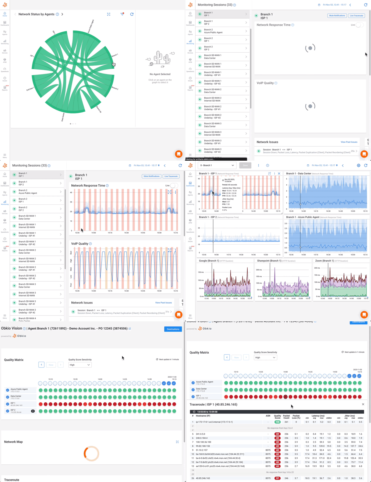
Network Response Graph This is your control center. You can see latency, packet loss, throughput, and other key stats in one clean view, and know instantly if something’s going wrong.
Sudden spike in latency? You’ll see it.
Gradual loss of throughput at a branch office? It’s right there.
Packet loss to a cloud app? Obkio will show you where it starts.
The goal of network monitoring isn’t just to watch numbers tick, it’s to know when something needs your attention. That’s where smart alerting comes in.
But here’s the trick: If you get an alert every time latency bumps up by a few milliseconds or someone downloads a big file, you’ll start ignoring them, and that’s dangerous. That’s alert fatigue.
Instead of setting alerts on every tiny blip, focus on the stats that signal real problems. Use thresholds based on meaningful statistics like percentiles and durations, not just momentary spikes.
Here are a few examples:
High 95th Percentile Latency (>150ms): Especially important for VoIP and video calls. One or two spikes might not matter, but consistent high latency in the 95th percentile means users are definitely feeling it.
Packet Loss Bursts (>1% sustained for 5+ minutes): Short packet loss might not even be noticed. But if it lasts for more than a few minutes, calls start dropping, and app performance takes a hit. That’s a red flag worth acting on.
Throughput Gaps (<70% of expected bandwidth): If you’re paying for 100 Mbps and only getting 50–60 Mbps consistently, you’re either hitting a bottleneck or not getting what you’re paying for — and users will feel the slowdown.
With a tool like Obkio, you can fine-tune alerting per site, per direction, or even per application path. That way, you’re not treating a small remote office the same as your data center, because they’re not.
You can also configure alerts to trigger only if the issue persists for a set duration (like 3 or 5 minutes), helping avoid alerts for those one-off network hiccups.
By setting thoughtful, statistics-based thresholds, you stay ahead of real problems, without constantly checking your phone or inbox for false alarms. And when something does go wrong, you already know where, when, and why.
Once your alerts are set up and you’ve started collecting valuable network stats, the next step is troubleshooting when something goes wrong. The beauty of having robust network statistics at your fingertips is that they allow you to move from assumptions to concrete evidence that there is a real network problem.
Correlate data to pinpoint issues:

Instead of relying on vague assumptions, network statistics give you concrete data that tells you exactly where the problem lies. Here's how you can correlate data and use it to troubleshoot effectively:
Look for patterns: If you see a latency spike, don’t just assume it's a network issue. Check if the packet loss or jitter follows the same pattern. For example, if high packet loss coincides with increased jitter, it could point to congestion in a specific segment of your network.
Compare different locations and devices: If you have multiple monitoring agents, you can compare stats across various sites. For instance:
- High latency at your main office: Is it just that location, or is it consistent across all sites? If it's only at the main office, the issue might be localized (e.g., a congested switch or a slow WAN link).
- Cloud apps showing issues: If you're noticing latency or packet loss only when accessing cloud apps, the issue could be with your ISP or even the cloud provider.
Check for network congestion: Throughput stats can reveal if there's a bottleneck somewhere in the network. If you're consistently seeing throughput gaps (<70% of expected bandwidth), it might mean that certain links are congested. Compare this with packet loss and latency — if both are high in the same area, you likely have a congestion issue.
Obkio Vision, Visual Traceroute Tool, takes network troubleshooting to the next level by automating the analysis process. It continuously monitors your network's health and helps you quickly identify and resolve performance issues. Here's how it works:
Flagging Anomalies: Instantly alerts you to unusual network behaviour like latency spikes or packet loss.
Identifying Root Causes: Pinpoints where issues occur across your network, from internal infrastructure to external providers.
Providing Troubleshooting Insights: Delivers actionable data on performance bottlenecks, helping you resolve issues quickly.
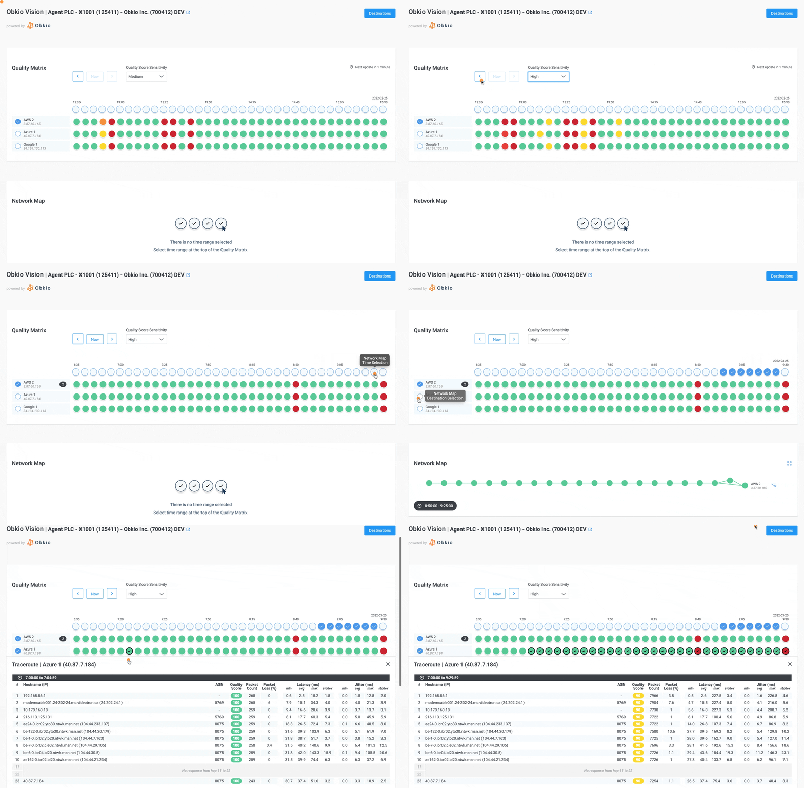
Let's say users are complaining about poor Zoom call quality — dropped calls, laggy video, or choppy audio. You can use your network statistics to drill down into the root cause.
Start by looking at latency: If latency is consistently above 150ms (the typical threshold for VoIP), that could be your first clue. But if you’re only seeing latency spikes on the 95th percentile graph, this suggests occasional congestion rather than a constant issue.
Check packet loss: If there’s more than 1% packet loss for 5 minutes or longer, that’s a major problem for real-time applications like Zoom. Correlate this with throughput and jitter — if both are high, it points to a network issue.
Look at the path: If you see poor performance at the remote office (but not at headquarters), this could indicate an issue with the WAN link between the two offices. Alternatively, if the latency and packet loss are worse for cloud-based Zoom servers, your ISP or cloud provider could be the culprit.
By correlating latency, packet loss, throughput, and jitter, you can pinpoint whether the problem is in your local network or with your internet provider or cloud service.
Collecting network statistics is only half the battle, the real value comes from interpreting them intelligently. Here’s how to transform raw numbers into actionable insights.
Modern monitoring tools provide dynamic dashboards that display trends through line graphs, heatmaps, and geomaps. These visualizations help identify patterns that raw numbers might obscure.
For instance, a latency heatmap might reveal consistent afternoon spikes that correlate with backup schedules, while a geolocation view could pinpoint a problematic branch office. The key is moving beyond static numbers to see how metrics evolve over time and across different network segments.
By collecting 2-4 weeks of performance data during normal operations, you can define what "normal" looks like for your specific environment. Smart baselines go beyond simple averages - they incorporate percentiles (like the 95th percentile that shows worst-case performance) and moving averages that smooth out temporary fluctuations.
This baseline becomes your reference point for identifying genuine anomalies versus normal variations. For example, you might determine that while average latency sits at 40ms, the 95th percentile at 120ms indicates some users regularly experience poor performance.
The most effective alert strategies use dynamic thresholds that account for both baseline performance and business context. Instead of generic "high latency" alerts, set conditions like "95th percentile latency exceeds 150ms during business hours" or "packet loss greater than 1% persists for more than 5 minutes."
Compound alerts that combine multiple metrics (like high jitter plus packet loss) can more accurately pinpoint developing issues. These intelligent alerts ensure your team focuses on genuine problems rather than chasing false positives.
When latency spikes, check whether it coincides with increased bandwidth utilization. If packet loss appears, examine error rates on nearby network devices. This multidimensional analysis helps distinguish symptoms from root causes.
For instance, simultaneous increases in both latency and packet loss likely indicate congestion, while high jitter with CRC errors suggests a physical layer problem. Modern monitoring solutions can automate much of this correlation, highlighting likely culprits based on metric relationships.
By examining how statistics change across different periods - comparing weekday versus weekend performance, or this month versus last month - you can identify both gradual degradations and recurring issues.
Perhaps throughput drops every Friday afternoon when weekly reports generate, or maybe latency has crept up 5% each month as your user base grows. These trends inform both immediate troubleshooting and long-term capacity planning.
A 2% packet loss might be trivial for email but catastrophic for VoIP. Statistics help quantify this impact - calculate how many users are affected, which applications suffer, and what the financial implications might be. This data-driven approach ensures you allocate resources to fixes that deliver the most value.
For example, addressing a latency issue affecting 200 sales team members might take precedence over a throughput limitation impacting 10 back-office users.
Regular reports should highlight key statistics, trends, and the business impact of network improvements. For instance: "After optimizing QoS policies, 95th percentile VoIP latency improved from 150ms to 90ms, reducing reported call quality issues by 75%." .
These reports justify investments, showcase successes, and create a performance history that aids future troubleshooting.
The interpretation process ultimately follows a logical flow:
- Visualize to spot patterns
- Baseline to define normal
- Alert to catch deviations
- Correlate to diagnose causes
- Prioritize based on impact
This structured approach transforms network statistics from abstract numbers into a powerful tool for maintaining optimal performance. With practice and the right tools, you'll develop an intuitive understanding of what your network's metrics are telling you - and how to respond effectively.
Interpreting network statistics is both an art and a science. To truly optimize performance and prevent issues before they escalate, IT teams should adopt these best practices:
Waiting for user complaints means you’re already too late. Continuous 24/7 monitoring ensures you catch anomalies before they impact productivity.
- Deploy modern tools (like Obkio) to track critical stats in real time.
- Set preemptive alerts for thresholds, don’t just rely on averages.
- Monitor beyond business hours, many issues (backups, updates) occur overnight.
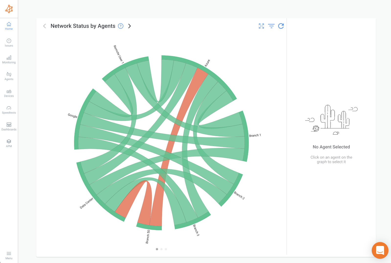
Raw numbers can be overwhelming. Dashboards, Chord diagrams, and trend graphs turn complex statistics into actionable insights.
- Dashboards reveal peak congestion times (e.g., 3 PM bandwidth crunches).
- Historical trend lines show gradual degradation before it becomes critical.
- Chord diagrams highlight location-specific problems (e.g., a failing branch office switch).
Network performance isn’t static. Monthly or quarterly reviews help track long-term trends and justify upgrades.
- Compare current stats to baselines — is latency creeping up?
- Identify seasonal patterns (e.g., higher utilization during fiscal year-end).
- Document improvements (e.g., "After QoS tuning, packet loss dropped from 1.2% to 0.3%").
Network health isn’t just an IT concern — share insights with leadership, vendors, and teams to align priorities.
- For executives: Tie stats to business impact (e.g., "10% faster file transfers = 15 fewer support tickets/week").
- For vendors: Use hard data to hold ISPs accountable (e.g., "Packet loss spikes occur on your backbone").
- For IT teams: Train staff to interpret stats for faster troubleshooting.
If you’re new to network statistics, focus on three key metrics first (e.g., latency, packet loss, uptime). Once mastered, expand to:
- Application-specific monitoring (VoIP, cloud services).
- End-user experience tracking (remote workers, SaaS performance).
- Predictive analytics (AI-driven anomaly detection).
By mastering these 8 network statistics and adopting proactive monitoring habits, IT teams can:
✔ Prevent outages before they happen
✔ Optimize performance with surgical precision
✔ Justify investments with hard metrics
✔ Align network health with business goals
Ready to take control? Obkio’s Network Monitoring makes it easy to track, analyze, and act on critical statistics, so you’re always one step ahead.
Start Monitoring Now – Because waiting for complaints is no longer an option.
- 14-day free trial of all premium features
- Deploy in just 10 minutes
- Monitor performance in all key network locations
- Measure real-time network metrics
- Identify and troubleshoot live network problems




 Obkio Blog


