











 Obkio Blog


 Subscribe
Table of Contents
Table of Contents
Every pair of Monitoring Agents in your Obkio account create a Network Monitoring Session to monitor network performance between the two agents. Every one of those monitoring sessions comes with its own dedicated page, automatically. You'll find it under the Network Performance tab: click into it, pick a network monitoring session from the list, and the full page loads for that specific connection.
This page has recently been refactored to surface more value at a glance, with three new widgets added on top of the original graphs and tables that were already there. Severity Summary and Network Quality are alert-based and appear on every session automatically. Status Overview is tied directly to Insights, so it only shows up once there's an active diagnosis for that session. Nothing needs to be configured for any of them.
This post walks through that page top to bottom, section by section, explaining what each part shows you and what you're actually getting out of it. Read together, this one page takes you from "something's wrong" to "here's why, how often, and here's my proof," without leaving it or cross-referencing anything else.
What is a Network Monitoring Session? 
Before diving into the page itself, it's worth understanding what you're actually looking at.
A Network Monitoring Session is configured between two Monitoring Agents to measure the network performance between them. Every 500 milliseconds, packets are sent between the agents, and network metrics (latency, jitter, packet loss, throughput, VoIP Quality, etc.) are calculated from those packets.
That's the key thing to know going in: a session isn't a report you assemble or a view you configure. It's a live, continuous measurement between two specific points in your network, and the page tied to it automatically reflects that data. Once you understand how to read one session's page, you know how to read all of them.


Network Monitoring Session Status
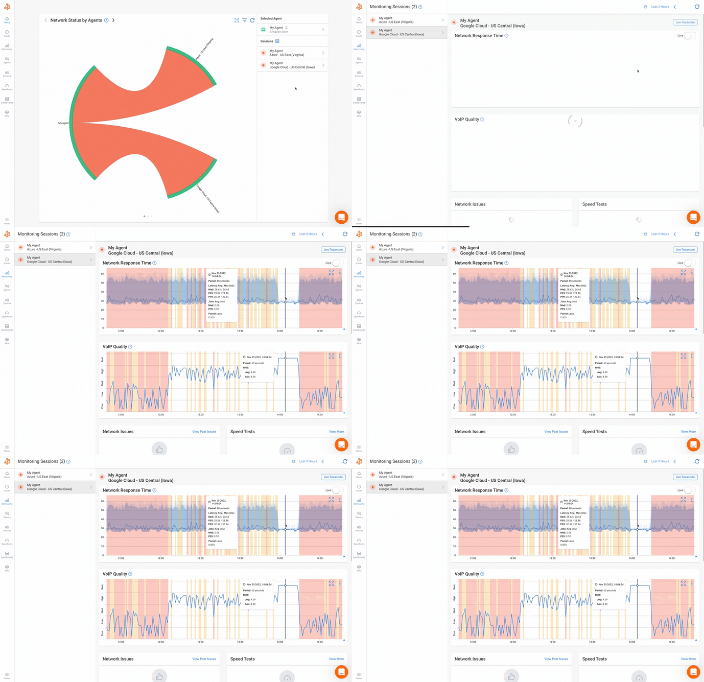
At the top of every session page, you'll find the basics: the session name (the two agents involved), its current status, and how long it's been in that state. For example, "It's been Ok for 12h 55min."
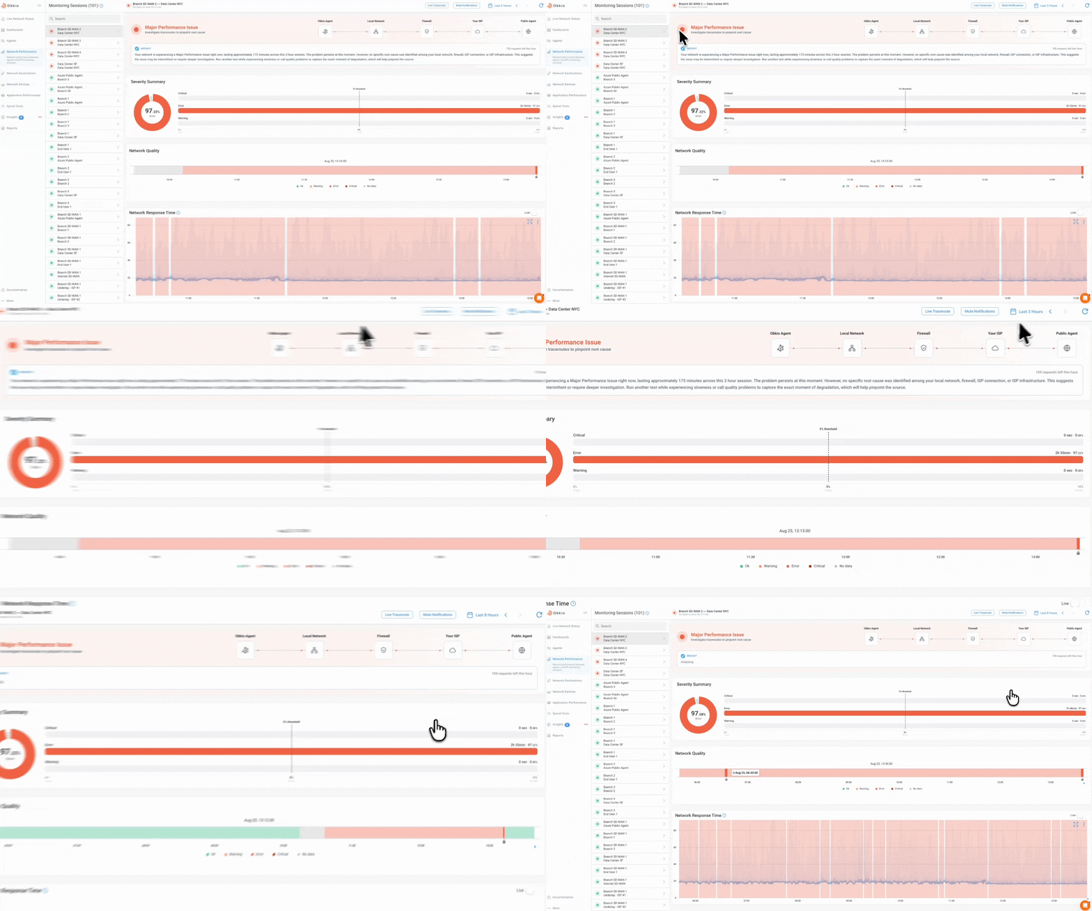
That status is to guide your attention toward the sessions with issues, so you can pinpoint a root cause as quickly as possible. There are four possible colours:
- Red: The session is either down or severely degraded
- Yellow: The session is degraded
- Green: Everything is good
- Grey: No data, unknown status, or the agent is in maintenance
These colours are tied directly to severity levels — Critical, Error, Warning, Information, and OK. Critical, Error, and Warning are the levels broken down further in the Severity Summary widget below; Info and OK aren't tracked there.
A few other controls live in this header:
- Live Traceroute: Jump straight into a real-time traceroute for this session
- Mute Notifications: Stop alerts for this session without leaving the page
- Date range selector: Move between time periods (Last 7 Days, custom ranges, etc.) to control what the rest of the page shows
Status Overview: What's Wrong and Where
The first widget you'll see on the page, sitting right below the header, is the Status Overview.
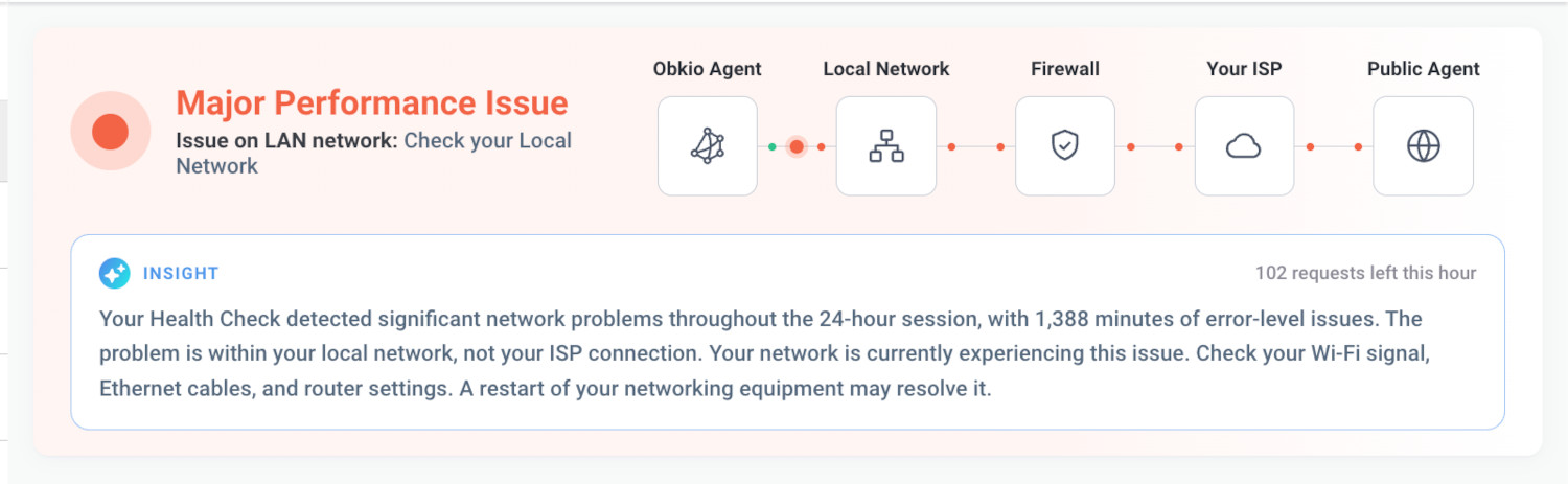
The Status Overview doesn't just tell you something is wrong. It shows you where. For this session, the widget surfaces the most impactful issue diagnosed during the selected time period, along with exactly where in the network path it's happening.
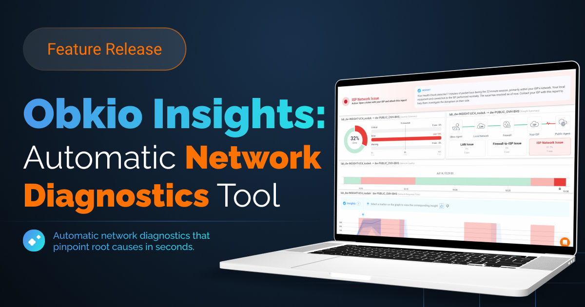
That diagnosis comes from Obkio Insights, the diagnostics engine running in the background on Internet-facing sessions (a local Agent monitoring the connection to the Public Agent). Insights identifies seven distinct root-cause labels in total; how many apply to a given session, three or six, depends on whether Device Monitoring is configured:
- Without Device Monitoring: Issue on LAN network, Issue between the firewall and the ISP's local loop, Issue in ISP's network. With Device Monitoring: Issue on LAN network, High bandwidth usage on firewall, High CPU usage on firewall, High memory usage on firewall, Issue on ISP's local loop, Issue in ISP's network.
Each Insight it finds has a name, a severity level, and an occurrence count for how often it showed up during the period.
The widget picks the most impactful Insight from that period, based on occurrence count, with severity as the tiebreaker, and displays it as a single status card:
- A severity headline (like "Major Performance Issue") with a coloured status icon
- The specific Insight name (like "Issue in ISP's network" or "Issue on ISP's local loop")
- A suggested next step, like opening a ticket with your ISP and sharing the report
Alongside the card, the issue path, Obkio Agent → Local Network → Firewall → Your ISP → Public Agent, highlights exactly which segment the diagnosis points to, so you're not just told what's wrong; you can see </i>where</i>.
Because this widget is tied directly to Insights, it only appears when there's an active diagnosis for the session. No Insight, no card, since a session with nothing to diagnose simply won't show this widget. Insights' diagnosis runs on issues flagged with Error status. Diagnoses for Warning and Critical status issues are coming in a future update. So a session showing Critical or Warning in the header may not yet have a Status Overview diagnosis to go with it.
This is the widget doing the heaviest lifting on the page: instead of staring at a spike in a graph and guessing what caused it, you get a name for the problem, a severity level, and a starting point for where to look next, before you've read anything else on the page.
The AI Summary
Below the path diagram, an AI-written summary fills in the narrative: how long the issue's persisted, whether it's isolated to one segment, and what's likely responsible. This text is AI-generated, so treat it as a strong starting point rather than gospel (it can occasionally miss a detail).
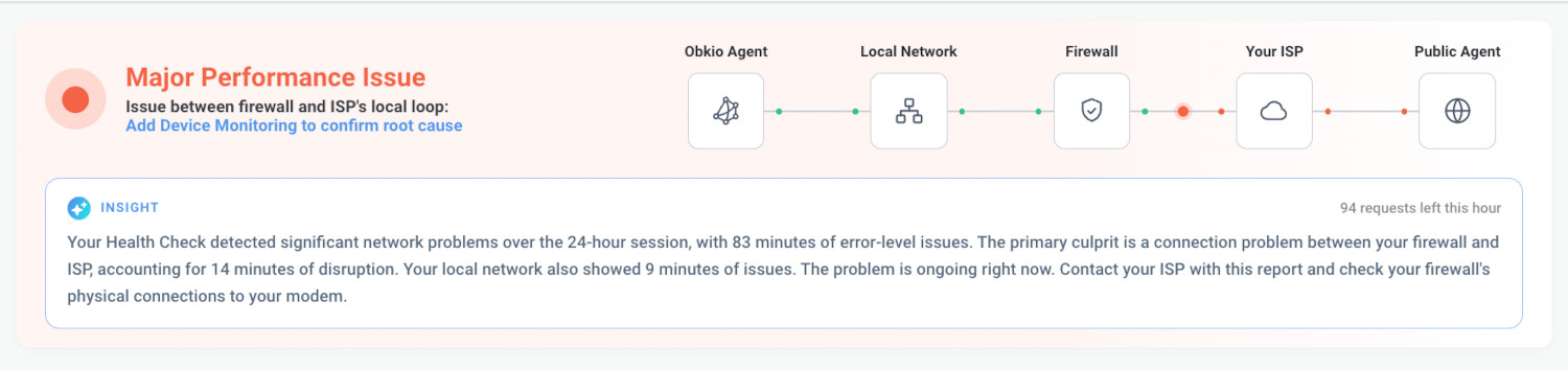
Each Agent is limited to two AI-generated summaries per hour, so if you're refreshing rapidly, the text may not update until the hour resets. (The diagnosis itself and the path highlighting aren't affected by this limit, only the written summary.)
Severity Summary: How Bad, and How Often
Right below Status Overview is Severity Summary, a widget built to answer one question: is this a real problem, or just noise?

On the left, a donut chart shows the percentage of the selected time period spent in the session's worst severity level. On the right, three bars break that down further by severity: Critical, Error, and Warning, each showing both the percentage of time spent at that level and the actual duration (for example, "15h 25min · 9.17%" for Error).
A dotted line marks a 5% threshold across all three bars. If a bar crosses it, that severity level has been present for a meaningful chunk of the period, not just a passing blip.
This is where you can see the monitoring session status as a trend instead of a single point in time. A monitoring session could be green right now but have spent hours in Error yesterday. The Severity Summary is what surfaces that history at a glance, so you know whether what you're looking at is a one-off or a pattern before you decide how urgently to act.
Network Quality: The Monitoring Session's Track Record
Below Severity Summary is Network Quality, a horizontal timeline showing the session's status over the selected date range, colour-coded the same way as the session status itself: green for Ok, yellow for Warning, red for Error, dark red for Critical, and grey for No data.

Instead of a single number, you get the shape of the monitoring session's history at a glance. A short red band surrounded by green tells a very different story than a session that's been intermittently yellow and red for days; the first is likely a one-off event, the second is a pattern worth escalating. Hovering over any point on the timeline shows the exact date and time, so you can line up what you're seeing here with a specific moment in the other widgets and graphs on the page.
This is the widget that answers "has this happened before?" without making you dig through historical reports separately. It's the session's track record, rendered as a single strip you can scan in a few seconds.
Network Response Time: The Proof in the Numbers
Below the three new widgets is Network Response Time, the graph that's been part of the session page from the start, and the one that gives you the raw data behind everything Status Overview, Severity Summary, and Network Quality have already told you.

Hovering over any point on the graph shows the exact network metrics behind it in a tooltip:
- Latency: How long it takes a packet to travel from one agent to the other, in milliseconds.
- The bold blue line running through the graph is the median latency, the 50th percentile.
- Around that line, shaded areas show the spread of the data: below the line, one band covers the 50th to 10th percentile and a lighter band below that covers the 10th percentile down to the minimum value recorded.
- Above the line, three bands cover the 50th to 90th, 90th to 95th, and 95th to 99th percentiles.
- The wider those bands, the more the latency jumps around instead of holding steady.
- Jitter: The variation in latency from one packet to the next. This matters a lot for real-time traffic like voice and video, where a steady delay is far less noticeable than one that keeps changing.
- Packet loss: The percentage of packets that never arrived at all.
- It shows up as a background colour rather than a line: yellow when it crosses the warning threshold (2% by default), and red when it crosses the error threshold (5% by default).
- Even small amounts can cause real problems for calls and video.
One thing worth knowing before you read this graph over a longer date range: Obkio aggregates data automatically so it can render a graph over long periods without trying to plot tens of thousands of data points at once, and when it does, it shows the worst value in each aggregated period. That means a graph over a full week can hide short, sharp bad events if you're just glancing at it.
The aggregation is built to surface the worst moments, but you'll want to zoom in on any period that looks suspicious to see the real values. You can do that by clicking and dragging over a section of the graph.
Obkio Insights on Network Response Time
You'll also see small marker icons along the top of the graph wherever Obkio Insights has detected something on this session. Clicking one highlights the specific window where that Insight occurred, directly on the graph, and shows the diagnosis above it.
For example, "Issue in ISP's network," with a timestamp. That's what connects this graph back to Status Overview: every Insight you see summarized above is also marked here, in context, on the actual latency data that triggered it.

This is your proof layer. If Status Overview told you there's a LAN issue, this graph is where you can see the actual latency and packet loss data that backs that diagnosis up; the kind of detail you'd want in hand if you're escalating to an ISP or a vendor.
VoIP Quality: What Your Calls Actually Sound Like
Below Network Response Time is VoIP Quality, a graph that shows results based on MOS score, a metric specific to voice call quality on this session.

MOS (Mean Opinion Score) is a 1-to-5 rating of perceived call quality, standardized by the ITU-T, where 1 is the lowest and 5 is excellent. Obkio measures MOS using the G.711 codec, the most commonly used codec for VoIP calls, which has a maximum score of 4.4.
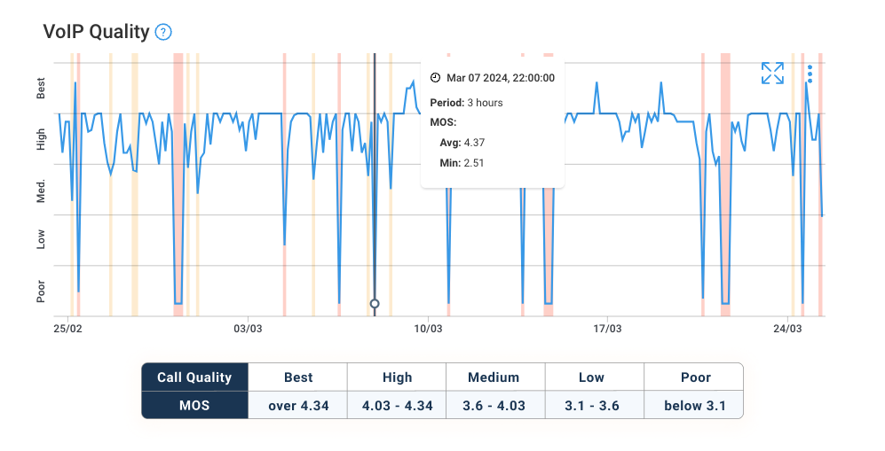
The y-axis runs from Best down to Poor, and hovering over any point shows the exact MOS score for that moment in a tooltip. A yellow background means Medium call quality, and red means Bad or Poor.
Just like Network Response Time, if there's aggregation over a longer date range, the graph shows the worst (lowest) MOS score recorded in each period, so a short bad stretch can still get flagged even when you're viewing a full week at once.
You'll also see the same Insight marker icons here as on Network Response Time. If Obkio Insights detected something during a period that also affected call quality, clicking the marker highlights that window directly on this graph too, so you can see whether a network issue actually showed up in the calls themselves, not just in raw latency.
Obkio also measures QoE (Quality of Experience), which reflects the actual end-user experience during a call. This is the piece that connects raw network numbers to something a real person would notice while talking.
This is the graph that catches the gap plain latency data can miss: a network can look fine on paper while calls are still choppy, and VoIP Quality is where that gets surfaced clearly, on a scale anyone can read at a glance.
Visual Traceroutes: Pinpointing the Exact Hop
Below VoIP Quality is Visual Traceroutes, a reinvented take on traditional traceroute, replacing text-based, one-time command-line output with continuous, colour-coded network path maps.
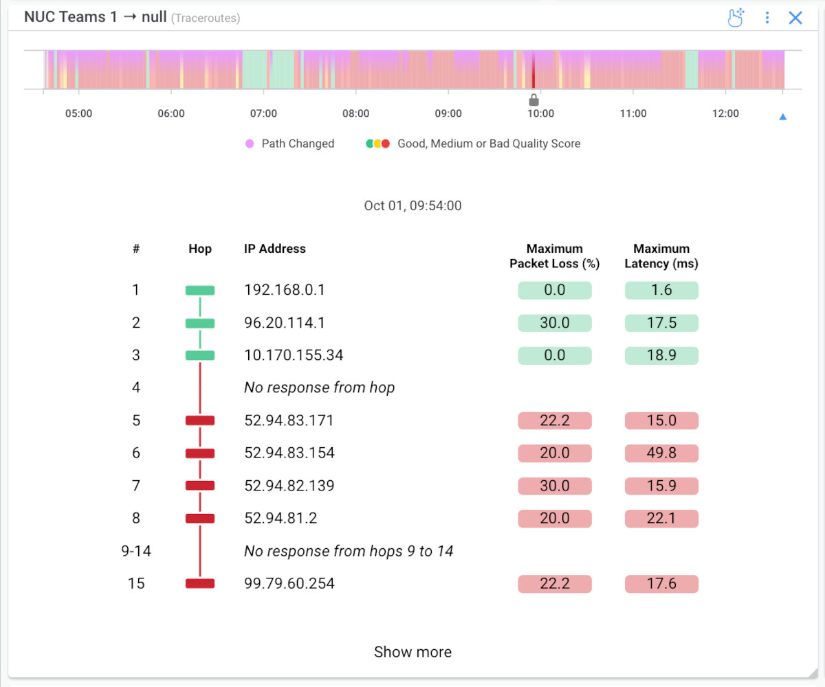
A timeline at the top uses the same colour coding as the rest of the page: green for great performance, yellow for some degradation, red for a definite issue, letting you see exactly when path problems occurred over the selected date range.
Clicking into any point on that timeline loads the Visual Traceroutes and hop-by-hop results for that specific moment, replacing walls of raw text with an interactive, visual path.
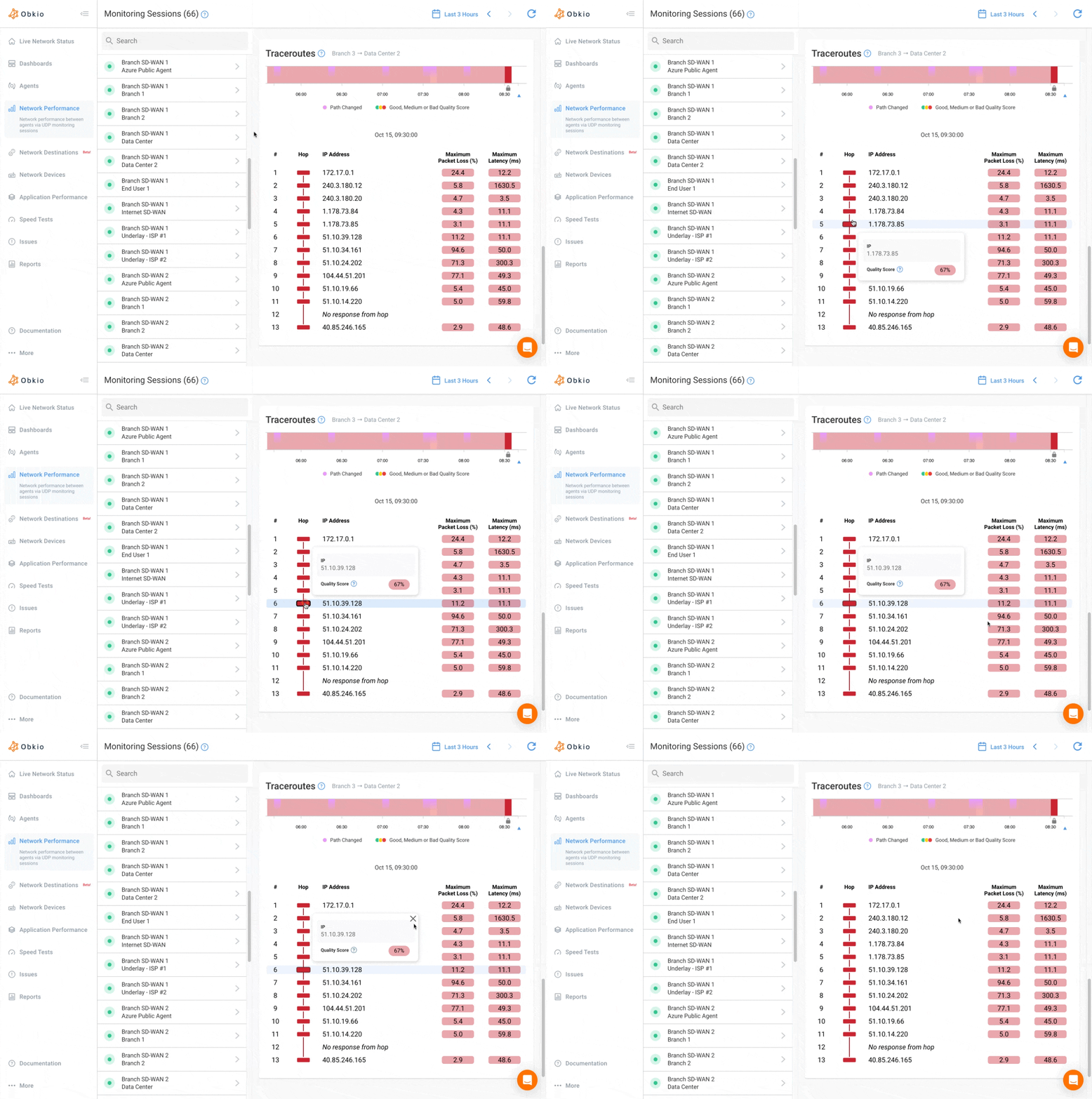
For each hop along the path, you'll see:
- Hop: The position of that device along the route
- Hostname / IP Address: Which device the packet passed through
- Quality Score: Colour-coded per-hop metrics including latency, packet loss, jitter, and MOS, so you can see exactly where degradation begins
- Maximum Packet Loss (%) and Maximum Latency (ms): The worst values recorded at that specific hop
Hovering over any hop shows IP addresses, quality scores, and hostnames in a tooltip, and if a hop doesn't respond, it's clearly flagged with a "No response from hop X" message instead of leaving you guessing.
Like the rest of this page, there's zero setup involved; as soon as a monitoring session exists, Obkio automatically starts running traceroutes in the background.
This is where you go from "the session looks bad" to "this exact hop is where it's bad." If Network Response Time shows a latency spike and Status Overview points to your ISP, Visual Traceroutes is where you can see which hop along the path is actually responsible, the kind of hop-level detail that turns a vague complaint into a specific one you can hand to an ISP or vendor.
Speed Tests: On-Demand Throughput Proof
Below Visual Traceroutes is the Speed Tests section, a list of speed test results run between the two agents in this session, with both directions shown separately: A→B and B→A throughput, since upload and download performance don't always match.
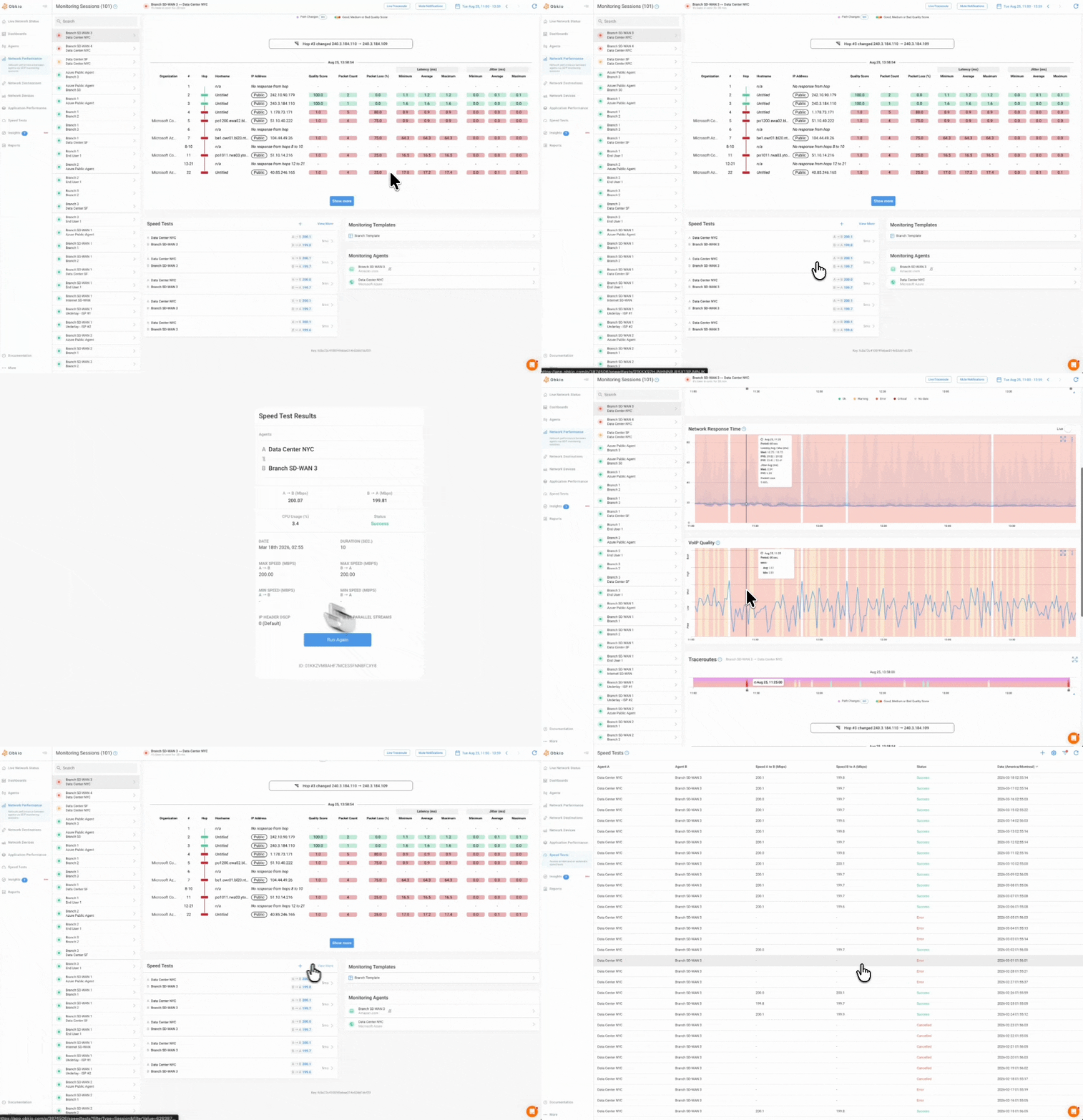
Each speed test result shows the two agents involved, the throughput recorded in each direction, and how long ago the test ran. You can also launch a new speed test directly from this section, or click View More to see the session's full speed test history.
That flexibility is what makes this section useful in two different situations: scheduled tests give you a consistent throughput baseline over time, while an on-demand test gives you a fresh number right now.
That makes this section your throughput proof point: if latency or packet loss numbers elsewhere on the page suggest a bandwidth problem, a quick speed test here gives you a concrete number to back that up.
How to Analyze Your Network Performance Sessions
Here's what this looks like in practice, using two real sessions in error.
Example 1: LAN issue
The header shows the session in error, marked red. Status Overview confirms it immediately: "Major Performance Issue — Issue on LAN network: Check your Local Network," with the issue path highlighting the Local Network segment specifically, right between the Obkio Agent and Firewall.
Severity Summary backs that up with a number: 9.17% of the last 7 days was spent in Error; well past the 5% threshold line, with 15h 25min of that time logged specifically as Error. Network Quality shows the shape of that pattern visually: several red bands scattered across the week rather than a single isolated blip.
From there, Network Response Time gives you the underlying data: the latency spikes and packet loss behind those red periods, each one lining up with the pattern already shown above. If more digging were needed, Visual Traceroutes would show exactly which hop on the path is responsible.
Four widgets, one page, no other tool needed: status told us something was wrong, the Status Overview told us why and where, Severity Summary and Network Quality told us how often, and Network Response Time gave us the proof.
Example 2: Firewall-to-ISP Local Loop Issue
This session tells a faster-moving story. It's only been in error for 1 minute, but Severity Summary already shows 97.78% Error over the selected 3-hour window, so it's been degraded for almost the entire period, with 2h 56min logged as Error.
Network Quality confirms it visually: the timeline is almost solid red from 12:00 onward, with only a brief green gap around 13:41.
Status Overview points to a different part of the network entirely this time: "Issue between firewall and ISP's local loop," with the issue path highlighting the segment between Firewall and Your ISP.
Notice the suggested next step here isn't just an explanation; it's actionable: "Add Device Monitoring to confirm root cause," a direct link to the specific thing that would help nail down the issue further.
Network Response Time backs this up with sustained high latency and an 11.20% packet loss reading right at the Insight marker (well above the error threshold) persisting across the entire graphed window rather than spiking briefly.
Beyond One Network Monitoring Session: Add Graphs to a Dashboard
Everything covered so far lives on a single session's page, built for looking closely at one connection at a time. And every graph and widget on this page (Status Overview, Severity Summary, Network Quality, Network Response Time, VoIP Quality, Visual Traceroutes, and Speed Tests) can also be added to a Dashboard.
That opens up a different way of working: instead of clicking through sessions one at a time, you can pull data from multiple sessions into a single custom view built around whatever you're actually trying to watch.
A few ways this gets used:
- Comparing sessions side by side: Put the same graph (say, Network Response Time) for several branch connections on one dashboard, so you can spot which location is actually struggling without opening each session individually
- Building a single view for a specific problem: Combine the Status Overview, Severity Summary, and Traceroutes for one troublesome session so everything relevant to that investigation is in one place
- Adding more than session data: Dashboards aren't limited to Network Performance graphs; you can bring in SNMP device data and Application Performance data alongside your session widgets for broader context
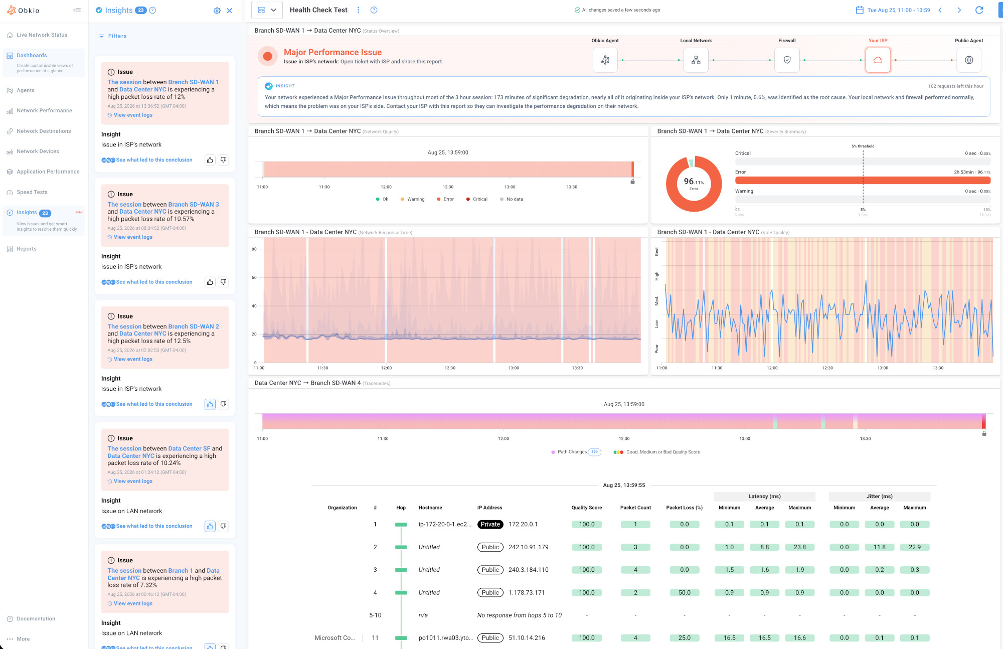
Where the session page is built for depth on one connection, a dashboard is built for breadth across many, and since the widgets are the same ones you already know how to read, there's no new interface to learn to get there.
Start Understanding Your Network Performance
That's the whole page, top to bottom: Status Overview to tell you what's wrong and where, Severity Summary and Network Quality to tell you how often, and Network Response Time, VoIP Quality, Visual Traceroutes, and Speed Tests to give you the proof to back it up. No setup, no configuration. It's there for every session in your account, the moment that monitoring session exists.
If you're not an Obkio customer yet, every widget covered in this post is already live in every account, on every plan, the moment you create your first monitoring session.
[Start your free trial] to see it on your own network.


