











 Obkio Blog


 Subscribe
Table of Contents
Table of Contents
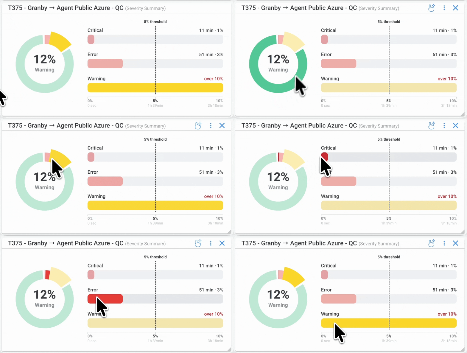
Obkio’s new Severity Summary widget is built to answer one question fast: “How healthy was my network overall, across every session I'm tracking?” Instead of opening session after session to check each one individually, you get a single combined view showing how much time your network spent in each severity level. This widget, along with other widgets and app updates being released, was created with the goal of making network performance easier to understand and interpret for all Obkio users.
Here's what it does and how it works.
What Is the Severity Summary Widget 
Obkio’s Severity Summary is a metrics matrix that combines network severity data from all the network monitoring sessions configured on the widget into one summary, showing total time and event counts for Ok, Warning, Error, and Critical over a time range you choose.
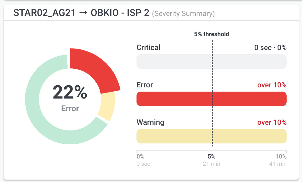
Rather than tracking one network monitoring session at a time, this widget takes however many sessions you assign to it and rolls them into a single set of numbers. If you're watching five site-to-site sessions, you don't need to check five separate widgets to know how your network performed. You check one.
This is a combined view, not a session-by-session breakdown. The widget does not list a row per session. All configured sessions feed into the same matrix.
Why We Built the Severity Summary Widget
Checking network health across multiple sessions one at a time doesn't scale, especially for teams managing several sites or a growing number of monitored links.
As networks grow, so does the number of sessions IT teams need to keep an eye on. Multi-site organizations, MSPs managing multiple clients, and larger networks with several ISP or WAN links all run into the same issue: no single view tells you how the network performed as a whole. You end up clicking through session after session just to build a mental picture.
Severity Summary removes that step. It gives you one matrix that answers the question directly, without asking you to do the aggregation in your head.
How to Use the Severity Summary Widget
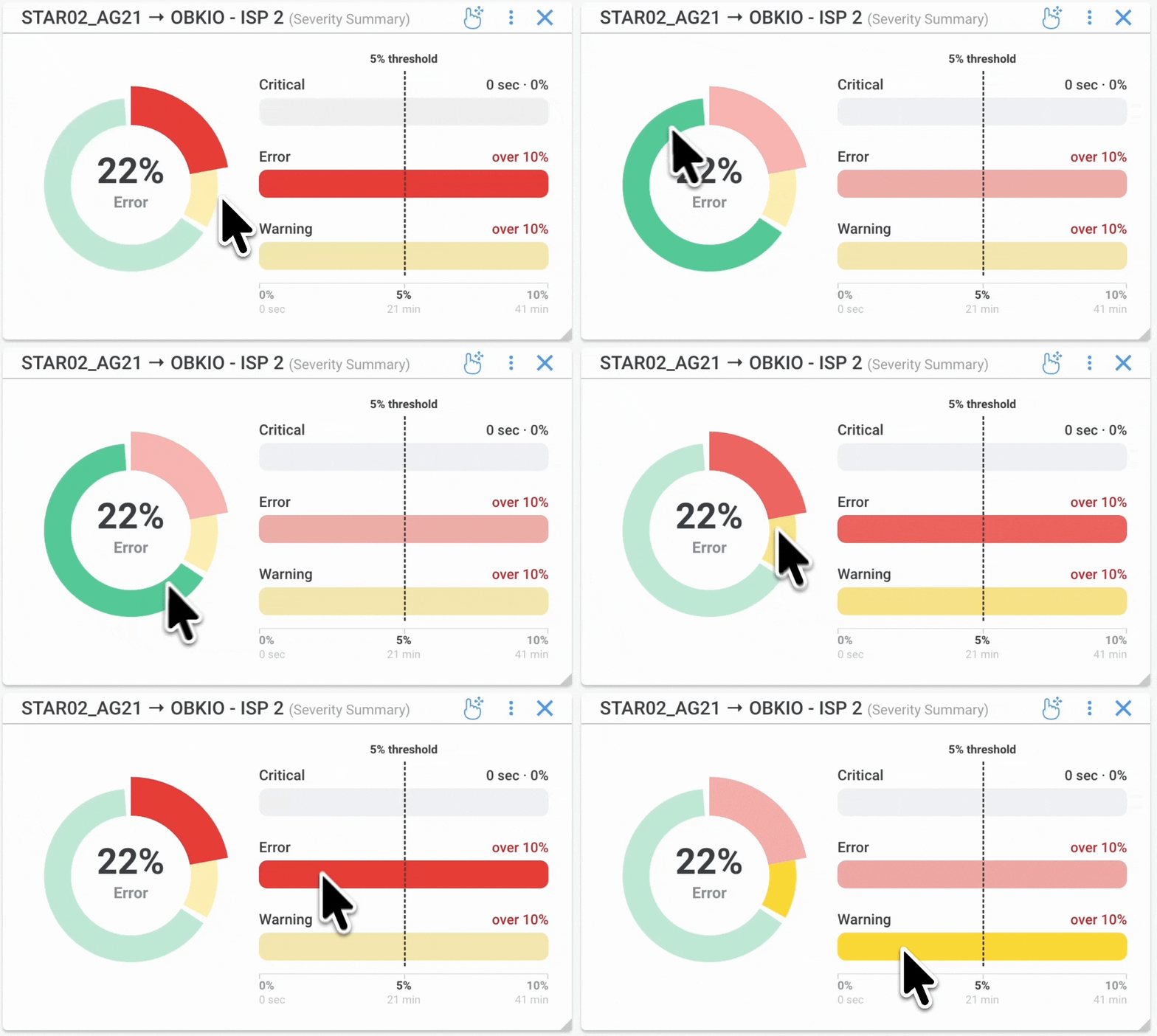
The widget can be added to any dashboard by clicking “Add Widget” and selecting “Severity Summary” from the menu. Then select the Agent and Monitoring Session you would like to display.
The widget will also be available by default when viewing network session performance in the Network Performance tab. Click on any network session to see how long that session has spent in each severity level, without needing to set anything up first.
How the Severity Summary Widget Works
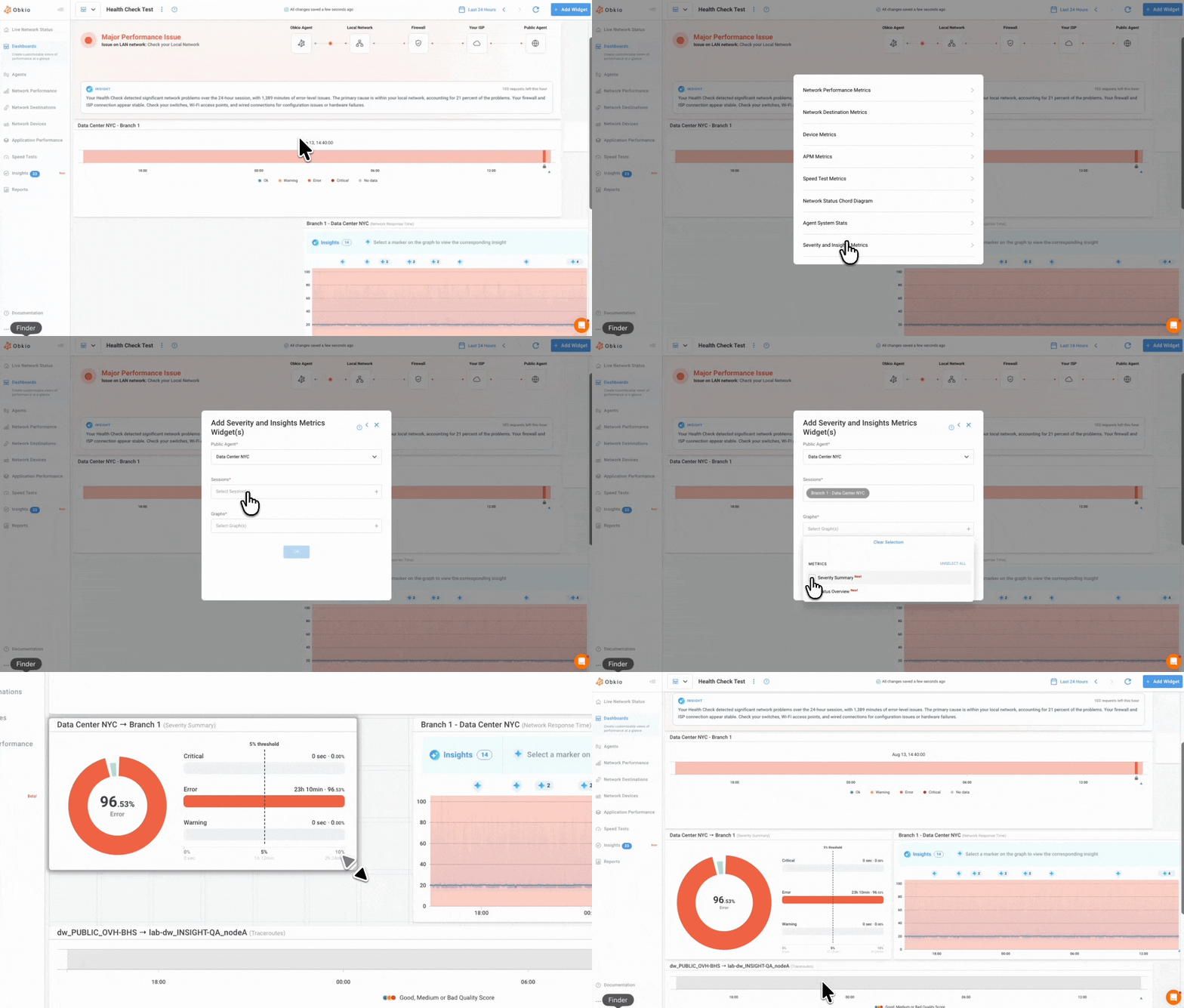
The widget shows four severity columns, Ok, Warning, Error, and Critical, each with the total combined time your configured sessions spent at that severity level during the selected time range.
The layout is simple.
Row 1 is the header row, one column per severity level:
- Ok (green)
- Warning (yellow)
- Error (light red)
- Critical (bold red)
Each column header uses a pill-style badge, a colored dot next to the label, on a lightly tinted background that matches the severity colour. Critical uses a light pink background with a bold red dot and red text. Ok uses a light green background with a green dot and green text, and so on.
Row 2 shows the combined time for each severity level, across all sessions configured on the widget, formatted to be easy to scan:
- Under 60 minutes shows as minutes, for example 9m
- 60 minutes or more shows as hours and minutes, for example 2h43m
- No time at that severity shows as 0m
Note that Info severity isn't part of this widget. Severity Summary uses four levels only: Ok, Warning, Error, and Critical.
How Time Range and Sessions Are Handled
The widget uses whatever time range and sessions you set, it doesn't default to a fixed window or to all sessions in your organization.
The time range follows wherever the widget lives. On a dashboard, it follows the dashboard's global date range. There's no separate time picker to configure inside the widget itself.
Session selection works the same way it does on other multi-session widgets you may already use, like the Network Metrics widget. You choose which sessions feed into it, one or several. Nothing is added automatically, so the widget only ever reflects the sessions you've explicitly configured.
Why This Matters for Network Troubleshooting
If you're responsible for network performance across more than one site, connection, or client, the Severity Summary widget saves you from piecing together severity data session by session. One matrix tells you how much time your network spent healthy, and how much time it spent degraded, across everything you're watching.
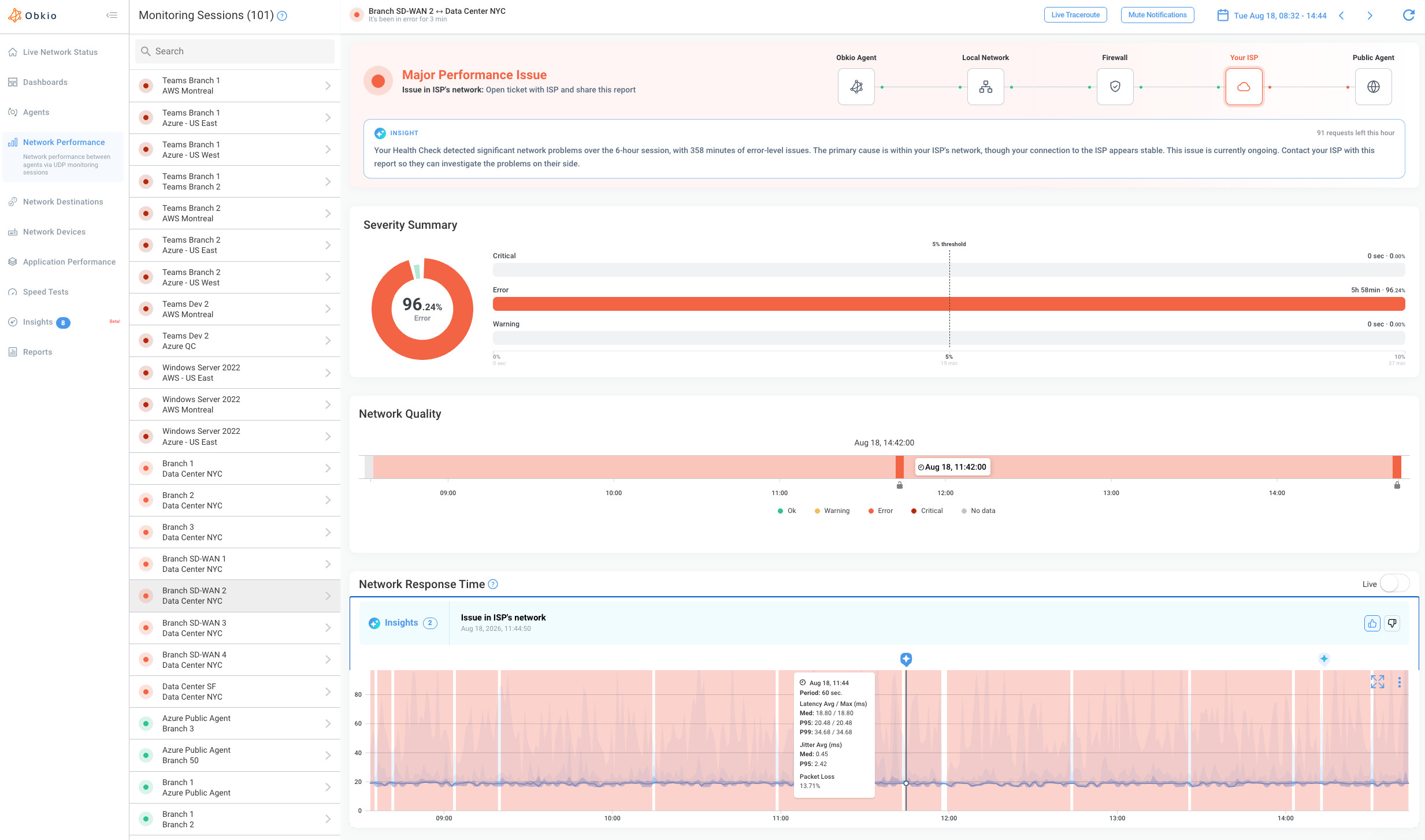
This widget is part of a broader shift powered by Obkio Insights, Obkio's automatic network diagnostics engine. At launch, Insights automatically diagnoses the root cause for issues at the Error / "Major Performance Issue" level, so once Severity Summary shows you where that time went, Insights is already working in the background to tell you why, without you having to dig through every segment manually.
Start free with Obkio and add the Severity Summary widget to your dashboard to see it in action.


We'd love your feedback on this one. Once you've tried it, let us know if it helped you interpret your data faster and get a clearer read on your network's overall state.


