







 Obkio Blog


 Subscribe
Table of Contents
Table of Contents
We've been making a series of improvements across Obkio’s Network Monitoring and Observability application, and a lot of that work has been focused on one goal: simplifying not just how we show network performance data, but how easy it is to actually interpret and understand that data. Not everyone monitoring a network has the time, or the networking background, to dig through graphs line by line to figure out what's going on. Sometimes you just need a fast, clear answer about how your network has been performing over time.
Obkio’s Network Quality widget is a new way to see your network's health over time without digging through graphs. It works like an uptime monitor, but for network performance. Every minute of your session gets coloured based on its worst severity, so you can spot degradation the second you look at the screen.
Here's what it does, why we built it, and where you'll find it.
What Is the Network Quality Widget? 
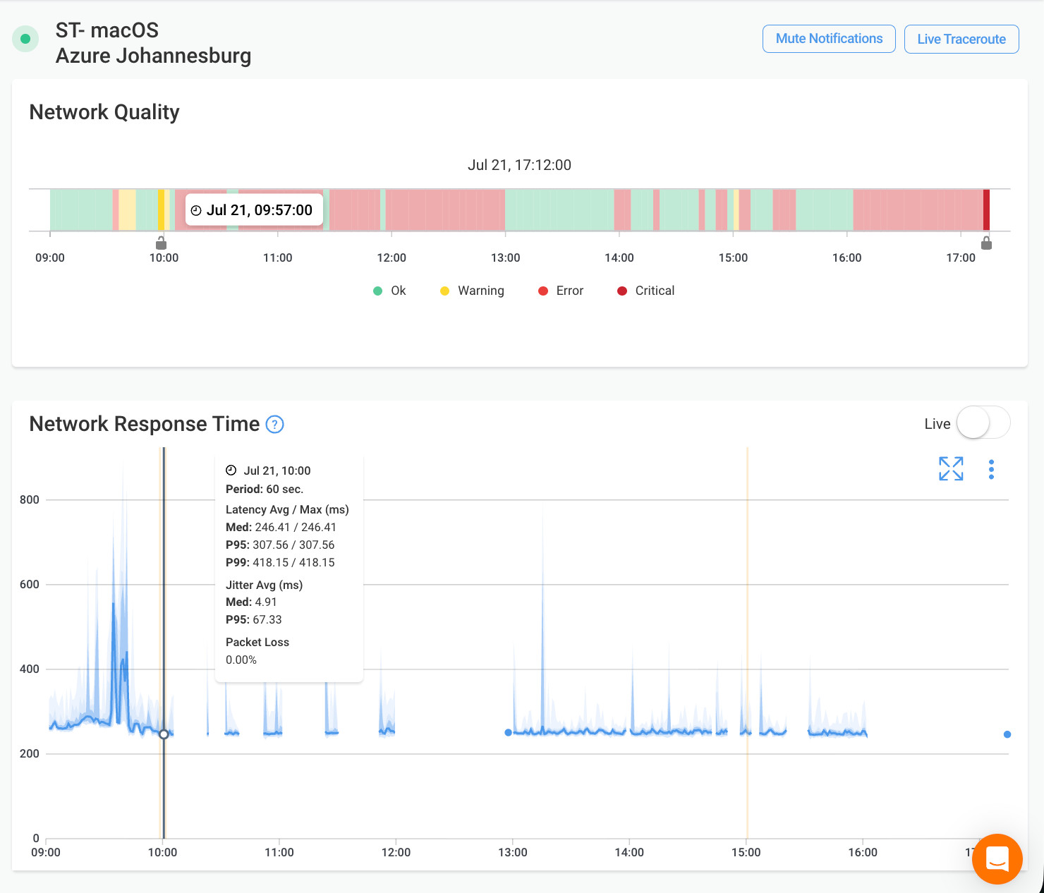
The Network Quality widget is a new network performance graph available exclusively in Obkio’s Network Performance Monitoring and Observability SaaS solution. It is a horizontal timeline made of small rectangular buckets, one for every minute of monitoring data. Each bucket is colour-coded based on the worst network severity recorded during that minute, so you can scan a full session and immediately see when your network was healthy and when it wasn't.
If you've used a status page like the ones cloud providers publish to show uptime history, the concept will feel familiar. Instead of tracking service availability, the Network Quality widget tracks network health, using the same severity levels Obkio already uses across the platform: Ok, Warning, Error, and Critical.

Why We Built the Network Quality Widget
Short answer: reading raw performance graphs to figure out when a network problem started takes too long, especially for IT teams who aren't network specialists.
Before this widget, understanding when a session degraded meant scanning latency, jitter, and packet loss graphs line by line and cross-referencing timestamps. That works, but it's slow, and it puts the burden on the person troubleshooting to interpret raw numbers instead of seeing the answer directly.
The Network Quality widget solves that by doing the interpretation up front. Instead of asking "does this latency spike mean anything,*" you get a colored bucket that already tells you the answer. It's part of Obkio's ongoing shift toward network observability, where the platform surfaces answers instead of just data.
How the Network Quality Widget Works
Quick answer: each bucket represents one minute, coloured by the worst severity recorded in that minute, and you can hover or click any bucket to get more detail.
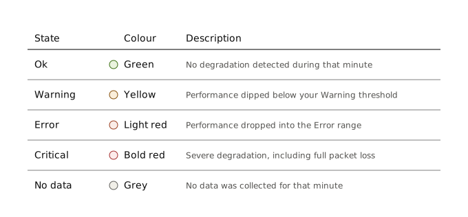
The colour scale is simple and consistent with the rest of Obkio's platform:
- Green (Ok): No degradation detected during that minute.
- Yellow (Warning): Performance dipped below your Warning threshold.
- Light red (Error): Performance dropped into the Error range.
- Bold red (Critical): Severe degradation, including full packet loss.
- Grey (No data): No data was collected for that minute.
If a single minute contains more than one severity level, for example a “Warning” event followed by an “Error” event, the bucket always shows the worst one. This keeps the timeline honest. You'll never miss a serious issue because a good moment in the same minute masked it.
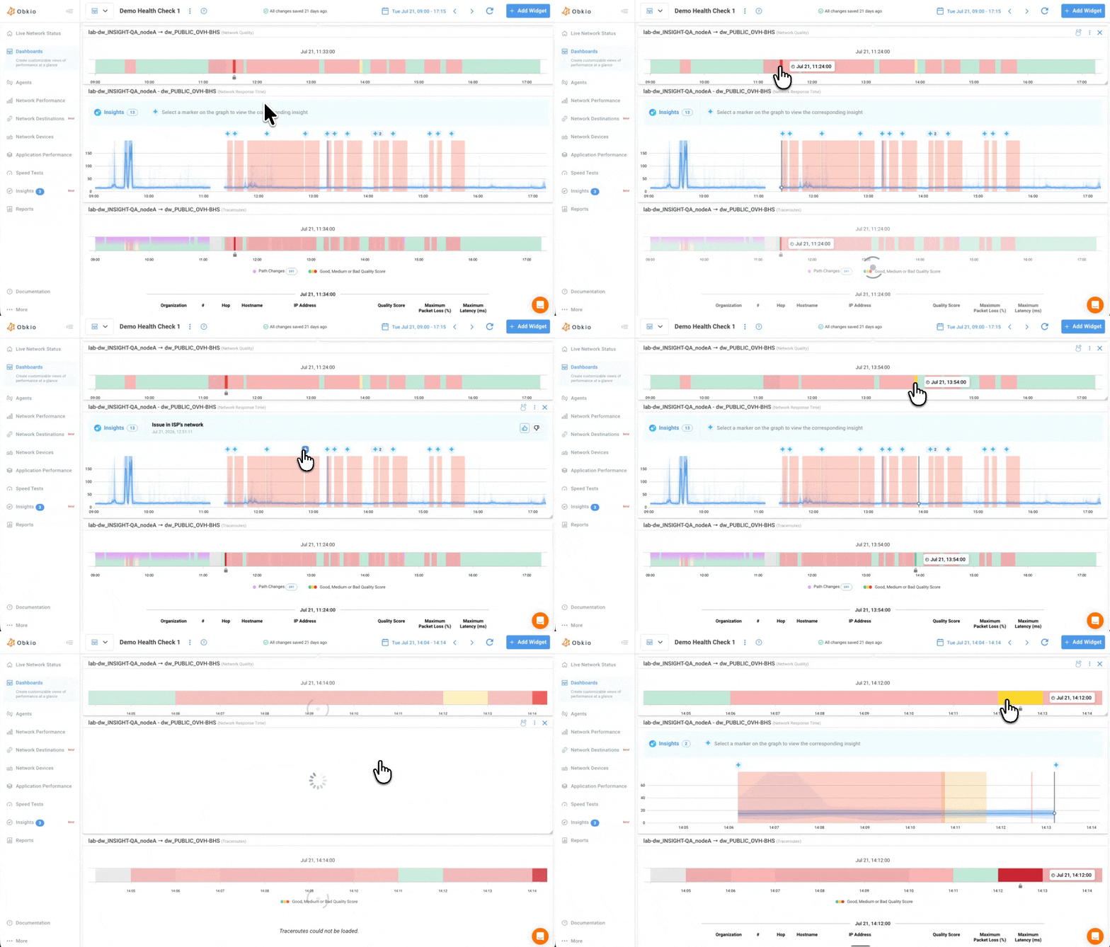
Hovering over a bucket makes it grow slightly, the same interaction pattern you'd see on a status page, so you can scan across the timeline and pick out the exact minute you want to investigate. Clicking a bucket goes further: it pulls up the alert events tied to that timestamp, right below the timeline, in the same spot where traceroute hops normally appear on the session page.
One thing worth knowing: if an alert event existed at some point but was later deleted or changed, the timeline will still show the severity colour for that minute, but clicking it won't bring up an event. This is expected behaviour for now, and it's something we're aware of as the feature evolves.
How to Use the Network Quality Widget
The widget is now included by default in every “Monitoring Session” page. The widget is also available by default when viewing network session performance in the "Network Performance" tab. Click on any network session to view network quality of that session by the minute.
To view Network Quality for your Monitoring Sessions:
- Click on the “Network Performance” tab.
- Select any Monitoring Session
- And the Network Quality widget will be at the top of the page by default, showing you the timeline of your network quality for that monitoring session.
The network quality widget can be added to any dashboard:
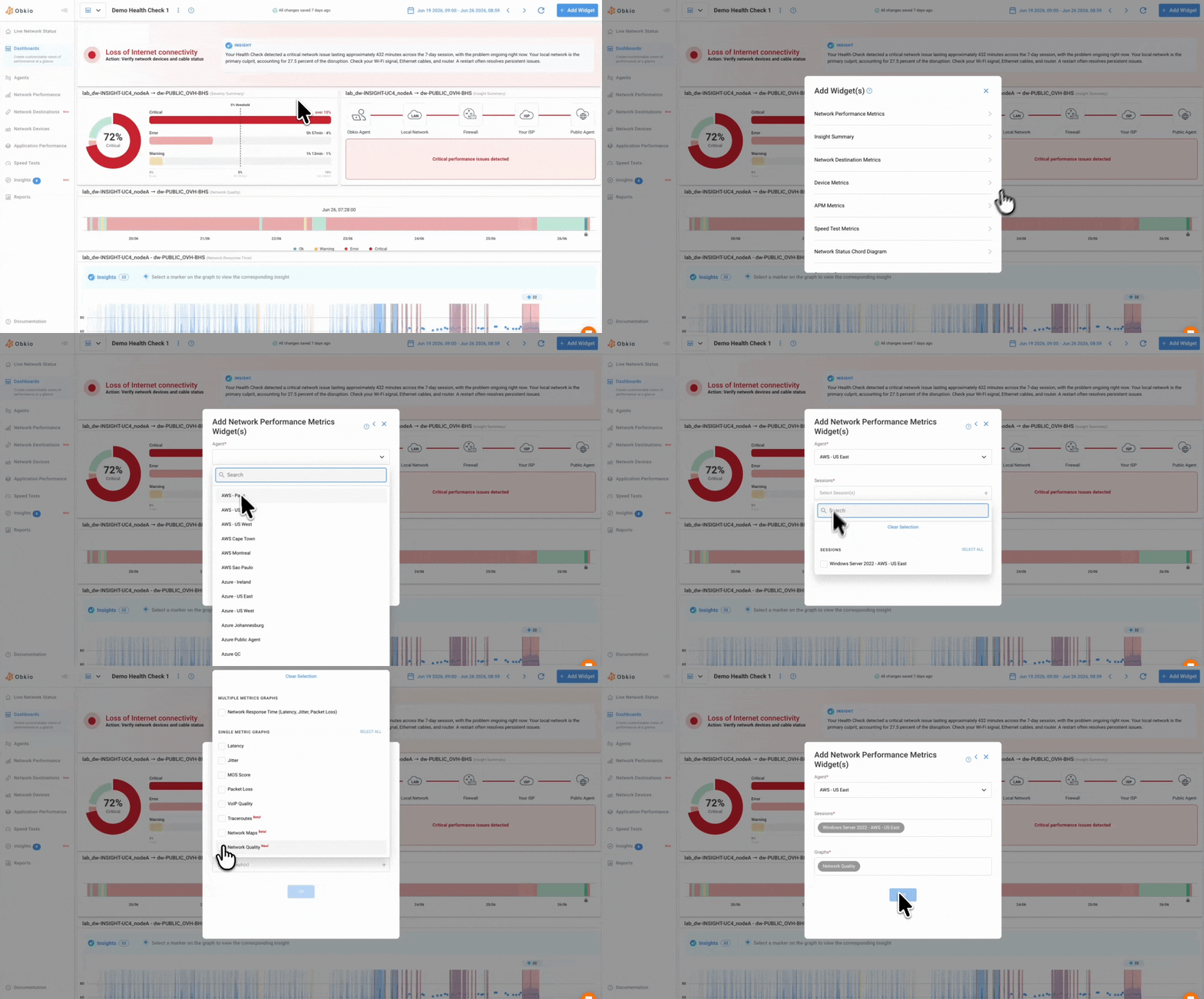
- Navigate to the “Dashboards” tab in Obkio’s app
- Click the "Add Widget" button
- Click the "Network Performance Metrics" section. There you’ll find the “Network Quality” widget.
- Simply choose the Monitoring Agents and Monitoring Sessions for which you’d like to display
- Click “Done,” and the widget will be added to your dashboard. You’ll then be able to resize and move the widget.
Why This Matters for Network Troubleshooting
If you manage a distributed network, whether that's multiple office locations, remote workers, or a mix of both, time spent figuring out when a problem started is time not spent fixing it. The Network Quality widget cuts that step out.
Instead of cross-checking latency, jitter, and packet loss graphs against timestamps, you look at one timeline, spot the red or yellow buckets, and click straight into the alert events tied to that moment. It's a small change on the surface, but it removes a manual step that every IT team using network monitoring tools has run into at some point.
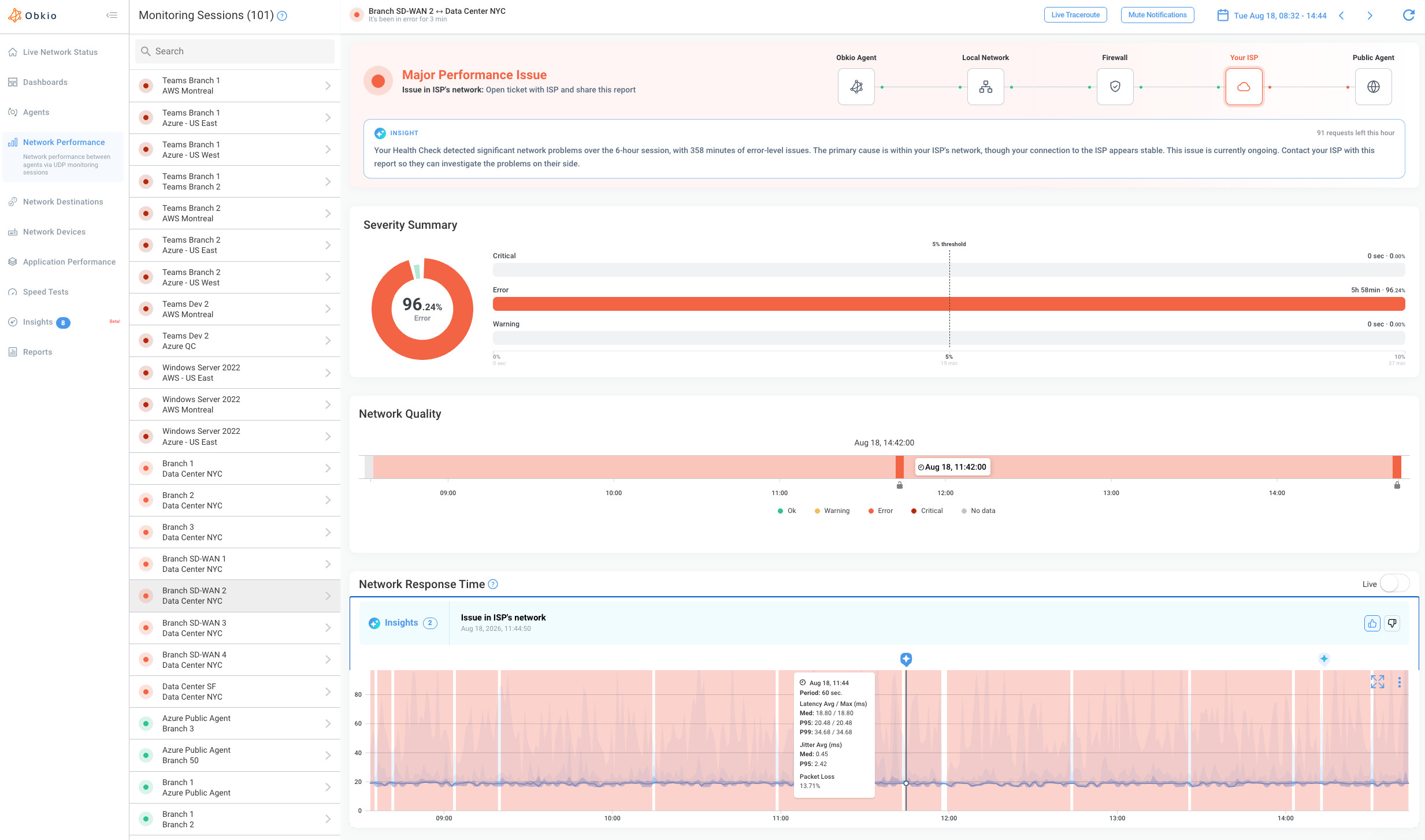
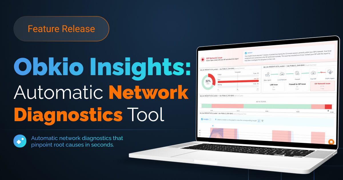
This widget is releasing alongside Obkio Insights, Obkio's automatic network diagnostics engine. Once you've spotted when a problem occurred on the timeline, Insight fills in the rest, automatically identifying where in your network it happened, without requiring manual investigation.
Start free with Obkio and add the Network Quality widget to your dashboard.


We'd love to hear your feedback and thoughts, and hope this makes it easier to interpret and understand the overall state of your network.