Network Map Widget
- What is the Network Map widget, how to use it & how to add it to a dashboard.
What you are going to learn:
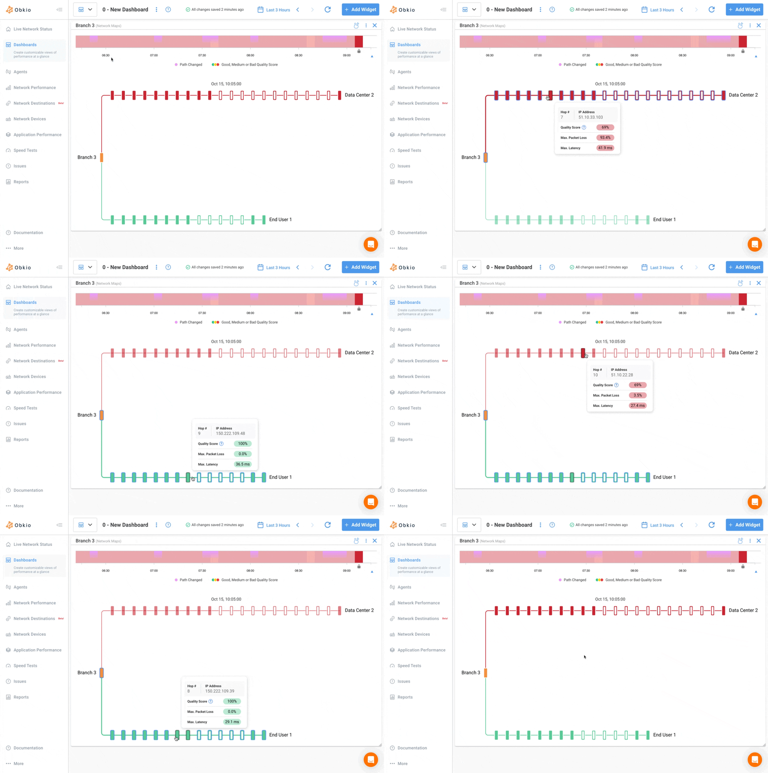
The Network Map widget displays all network paths from one source agent to multiple destination agents.
It works like a multi-session traceroute map, allowing you to visualize all hops, path changes, and quality scores across several monitoring sessions from the same source.
This widget helps you:
- Understand how routes differ between destinations.
- Detect shared network segments or bottlenecks.
- Correlate quality issues across multiple sessions in one view.

- The Network Map uses real-time traceroute data from the selected source agent to each monitored destination.
- Each line represents a unique path to a destination.
- Nodes (hops) represent routers or network points, with tooltips displaying:
- Hop number
- IP / Hostname
- Quality Score (%)
- Max Latency (ms)
- Max Packet Loss (%)
- The widget automatically updates as routes or network conditions change.
- Timeline (top):
- Shows overall network quality and path changes over time.
- Green indicates a good quality score, yellow indicates medium quality and red indicates poor quality.
- Purple markers denote path changes.

- Network Map (bottom): Displays all routes visually.
- Each colour-coded line represents one session path.
- Diverging lines indicate different routes, while converging lines indicate shared hops.
- Hover over a node to highlight common paths or identify high-latency hops and show the tooltip.
- You can click on the hop to make the tooltip persistent and click on the “X” icon on the top right to close it.
- Click
Add Widget. - Under the
Network Performance Metrics, select theAgentandSessionsthat you’d like to visualize. - Select
Network Mapunder Graph Type to add this widget. - The widget will then be added to your dashboard. You can resize or arrange the widget as needed; it automatically adapts to your screen size.
